

Don’t be a stranger —
Drop a line for more info or inquiries about custom type!
Drop a line for more info or inquiries about custom type!

display
headline
serif
humanist
Latin (Western Europe)
alternate characters
discretionary ligatures
stylistic sets
swash caps
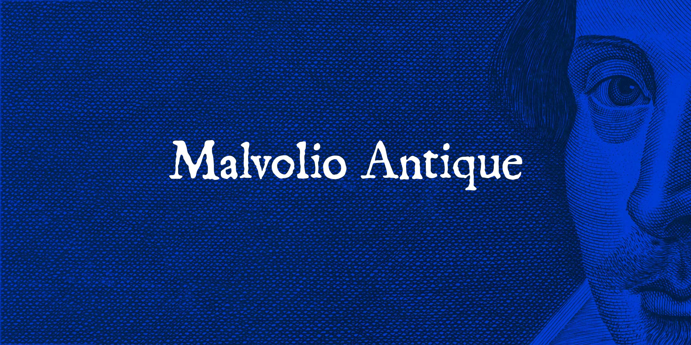
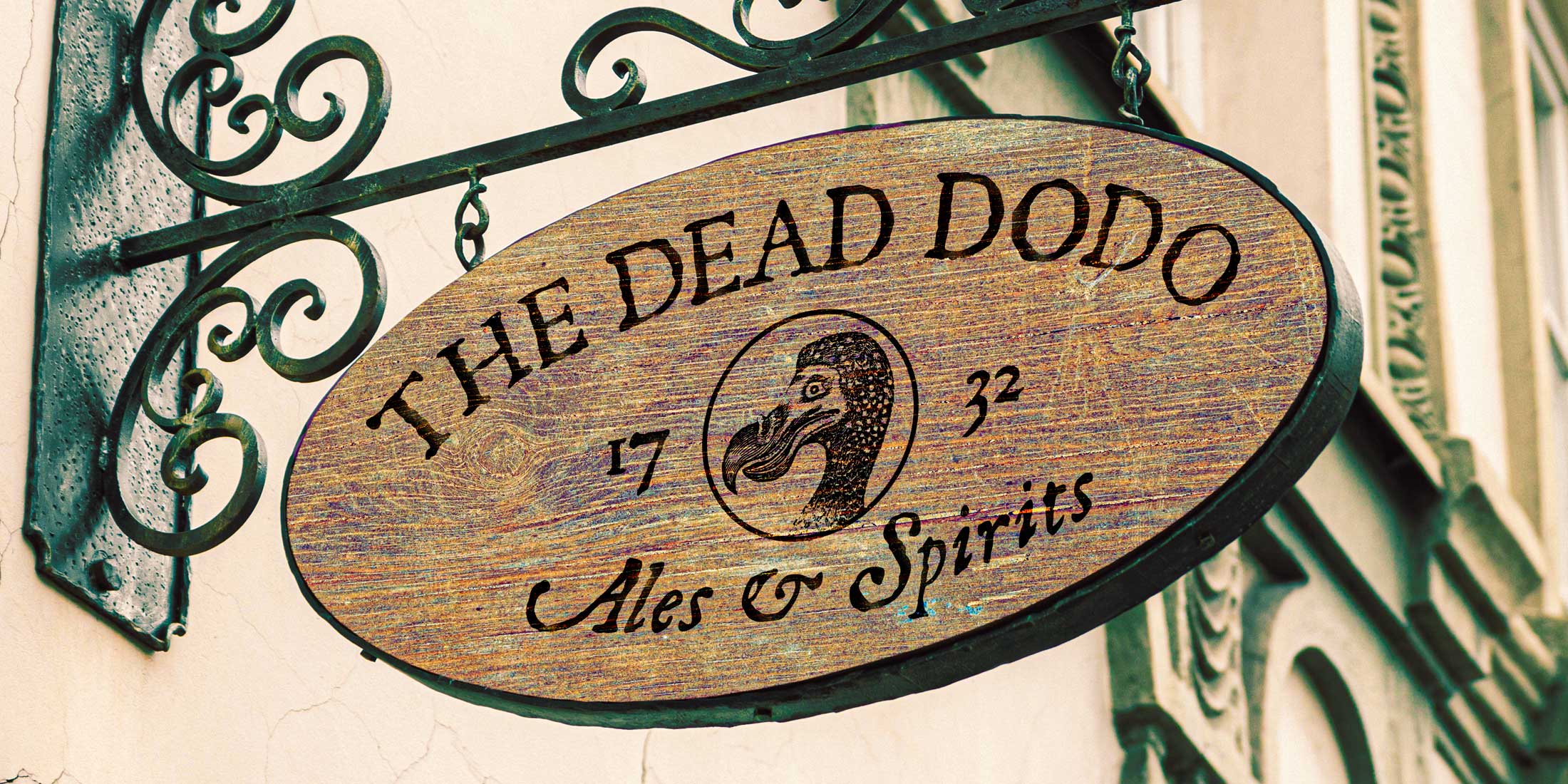
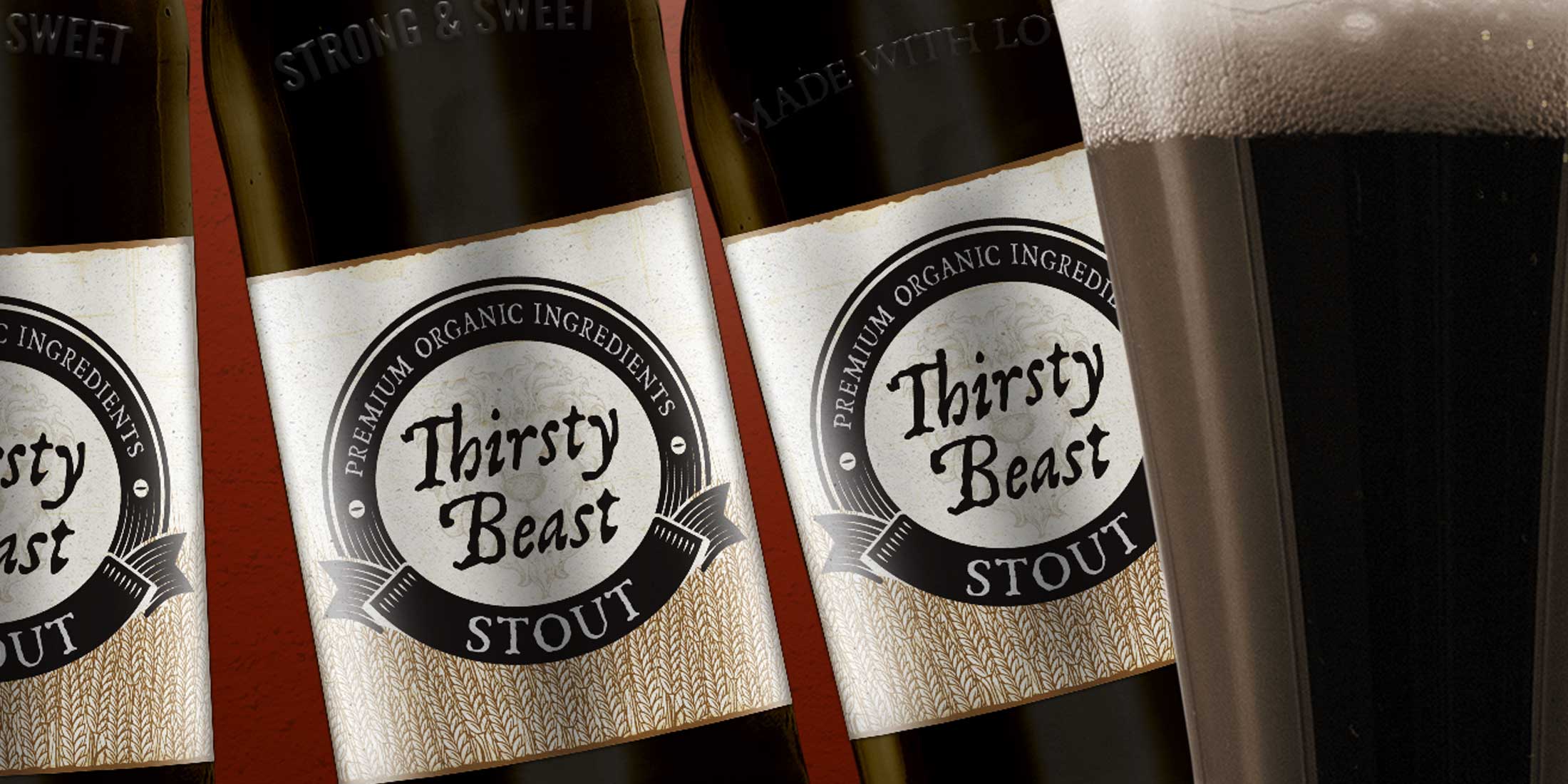
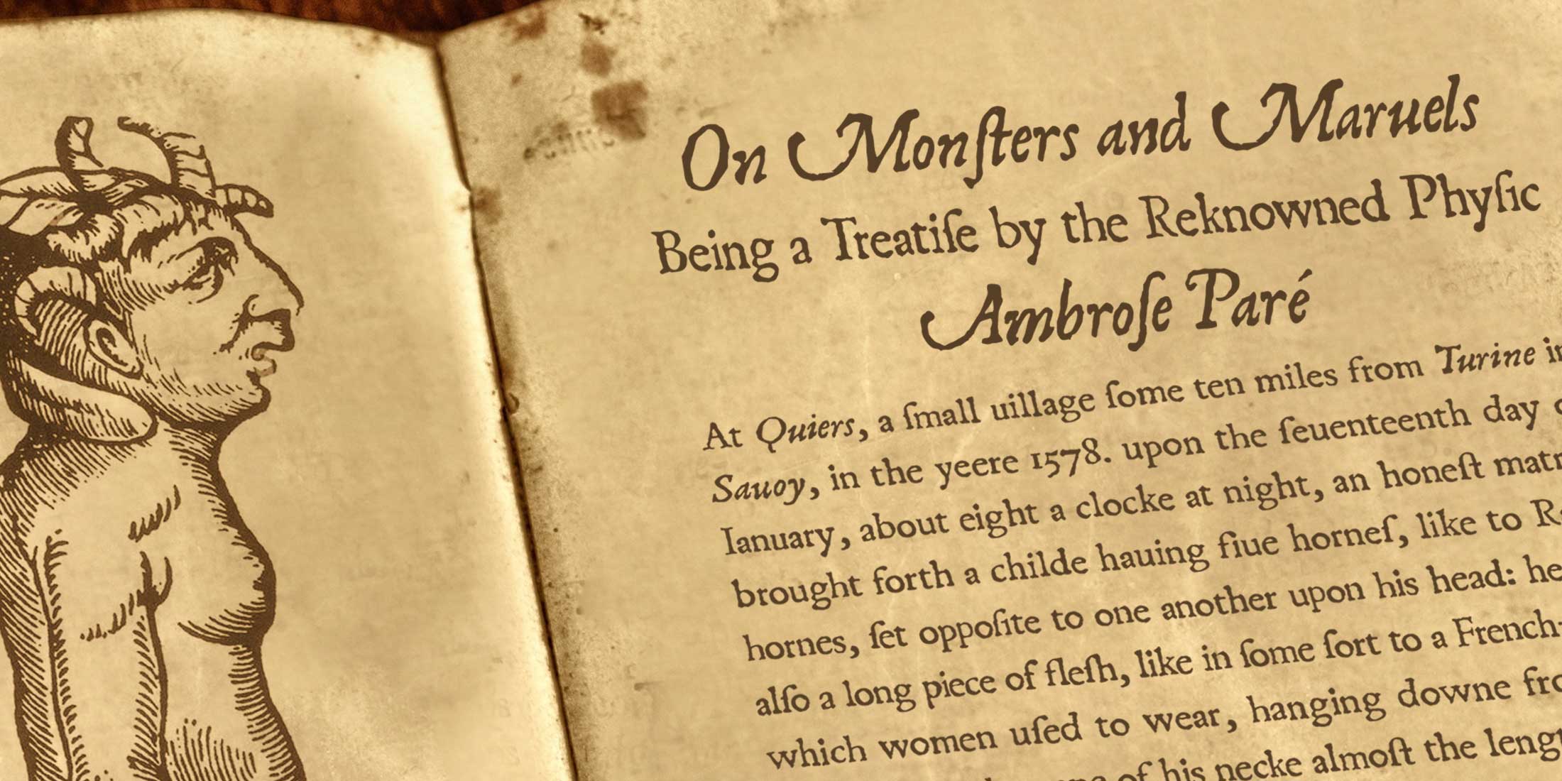
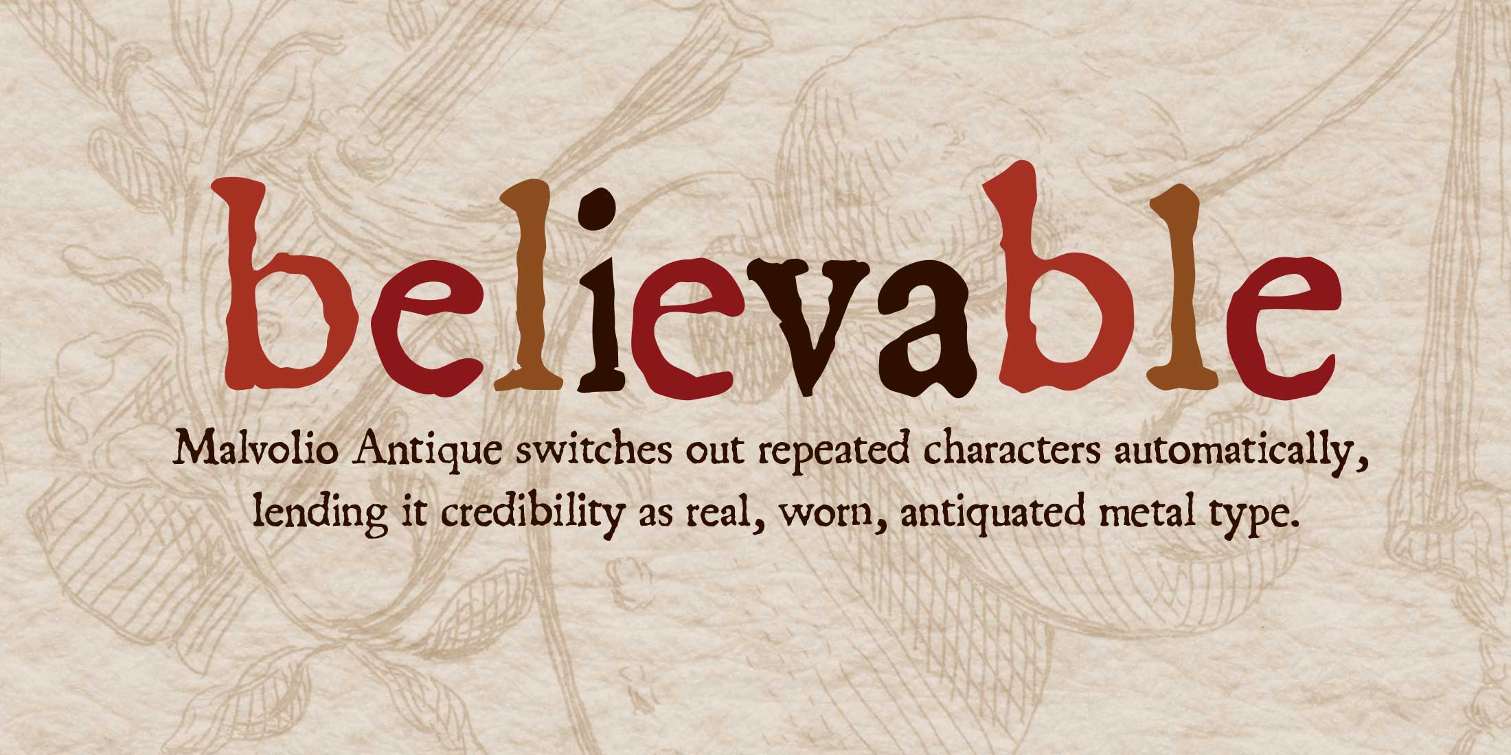
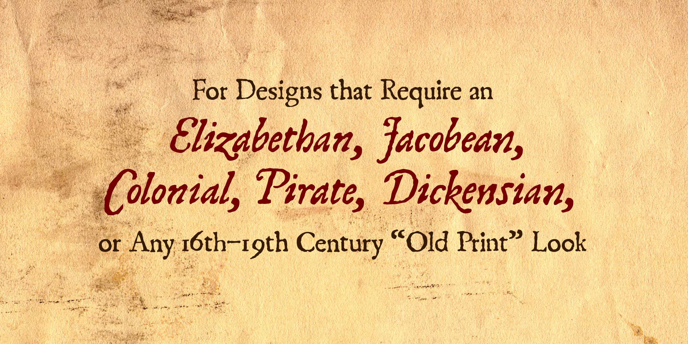
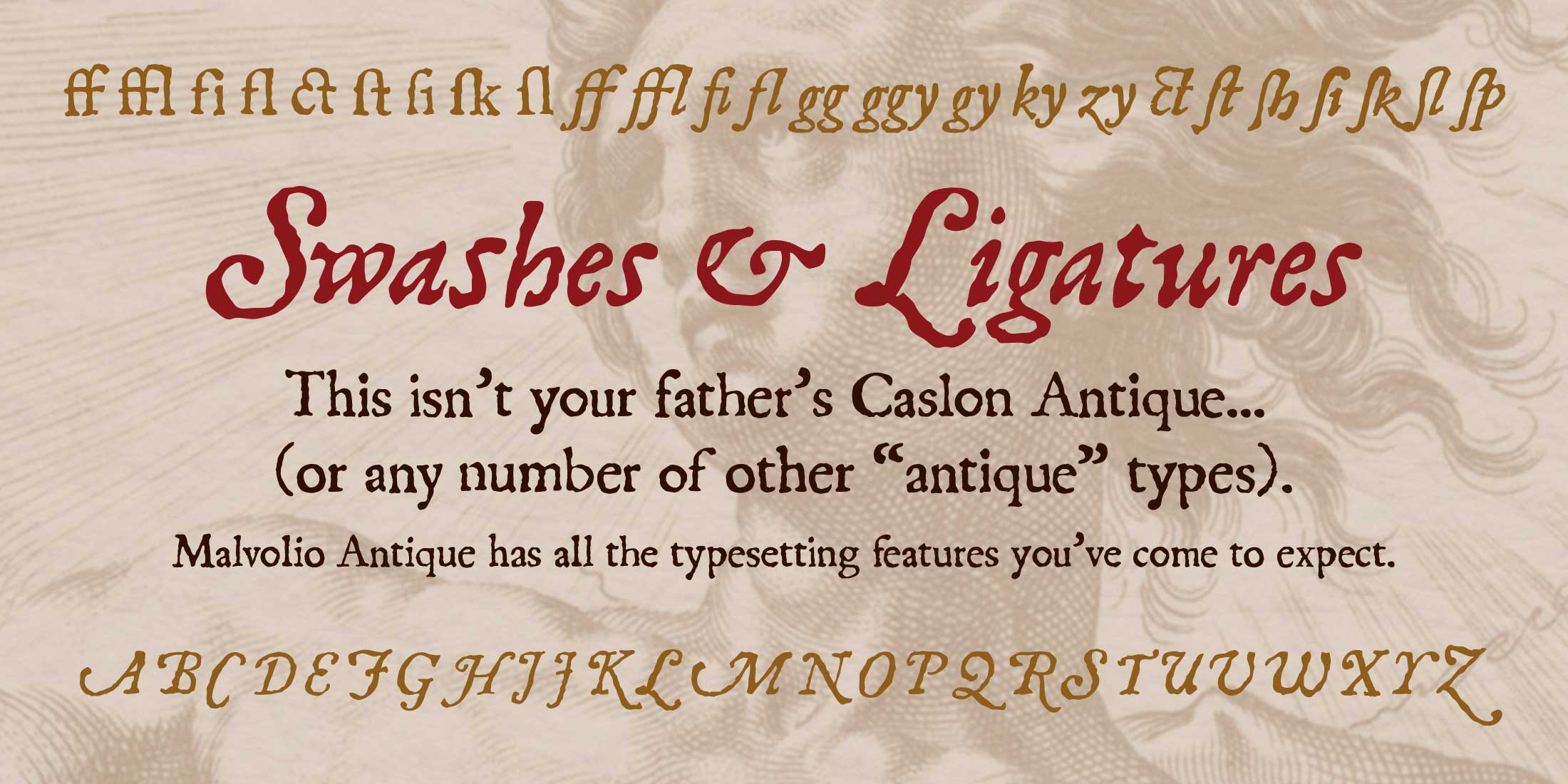
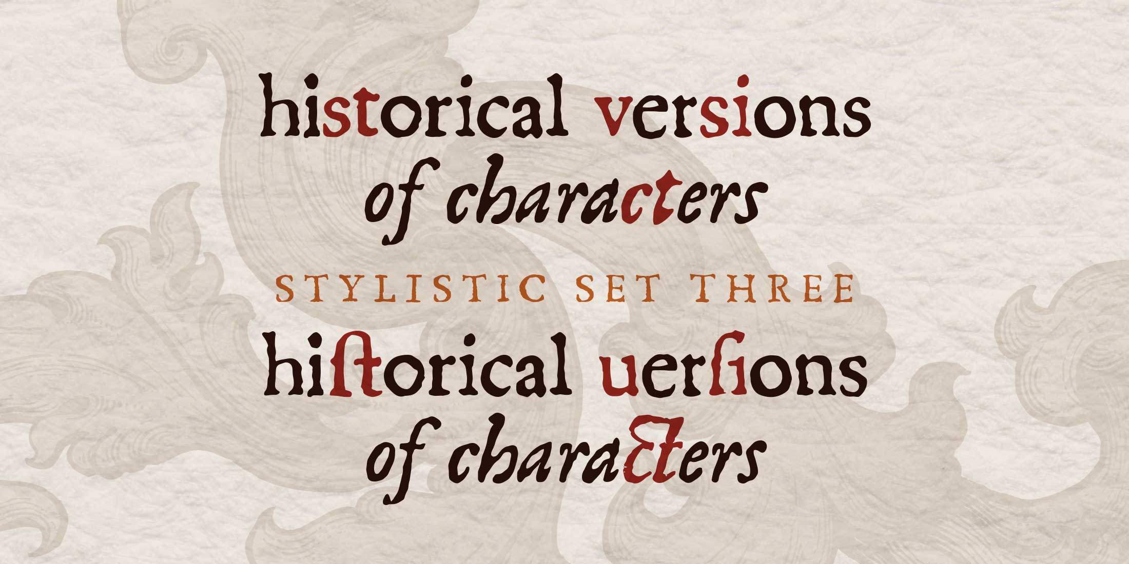
For many many years, Berne Nadall's Caslon Antique has been the staple typeface for all things meant to look like old metal type of the sort used from the 16th through the 19th centuries (think Les Misérables). Malvolio Antique adds features that make it easier to achieve that look, and much more realistically. Its automatic contextual alternates switch between three complete character sets so that repeated characters have different weathering, selling that they came from different pieces of metal type. Additionally, it has historical forms (initial and medial long s and its ligatures) and contextual alternates (u for v). Malvolio Antique Italic has a full set of Swash capitals. Both typefaces are adapted directly from the body type in Shakespeare's 1623 First Folio.