

Don’t be a stranger —
Drop a line for more info or inquiries about custom type!
Drop a line for more info or inquiries about custom type!
display
headline
humanist
serif
Latin (Western Europe)
Cyrillic
alternate characters
discretionary ligatures
ornaments
stylistic sets
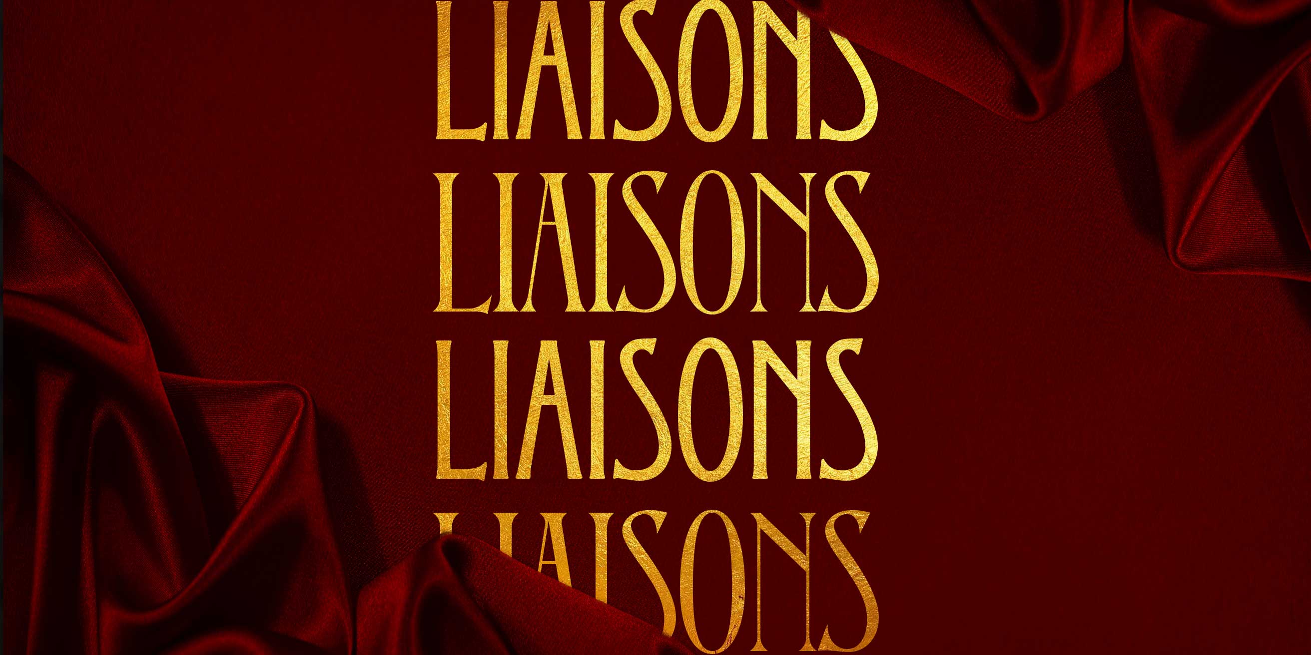
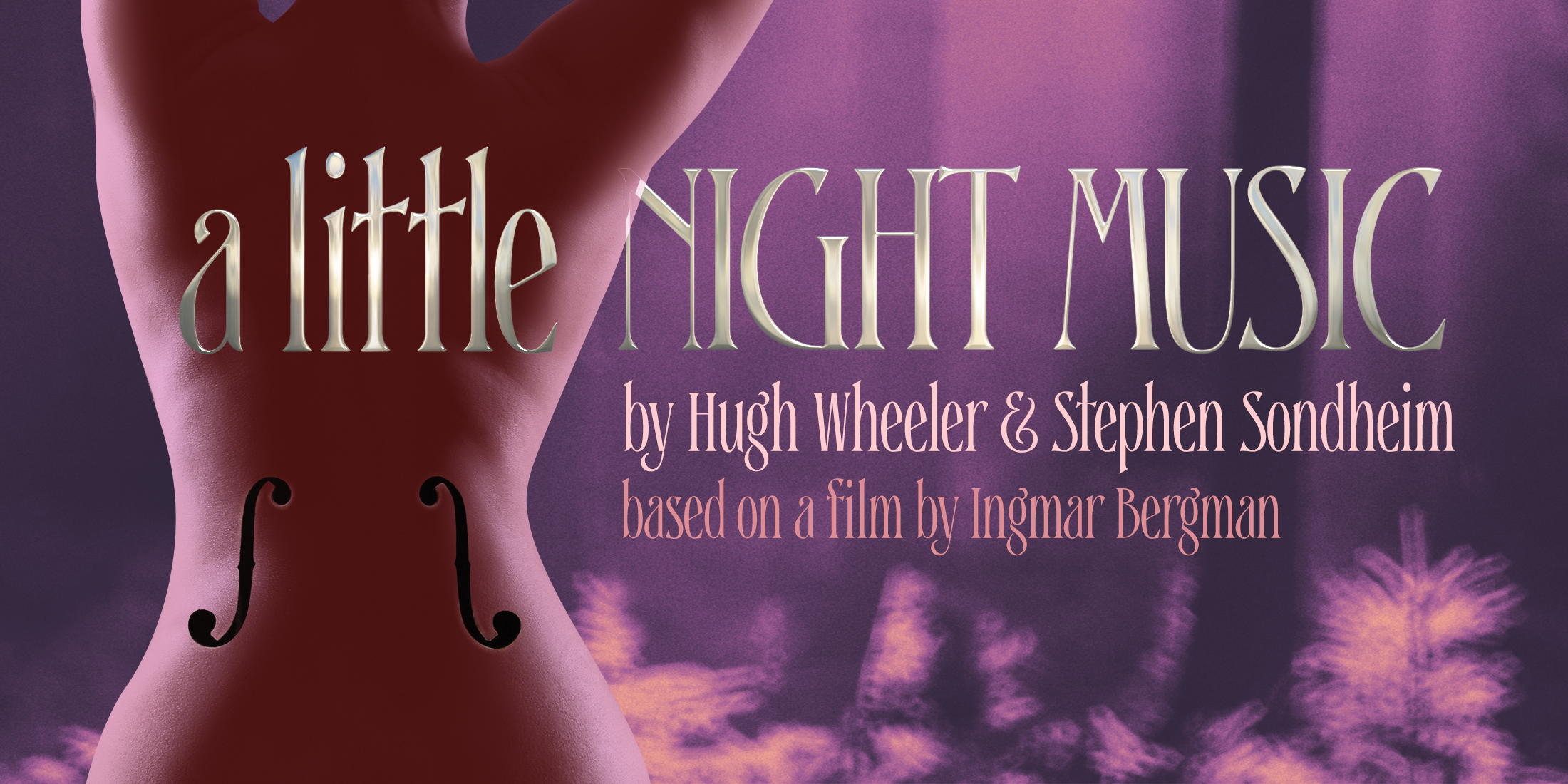
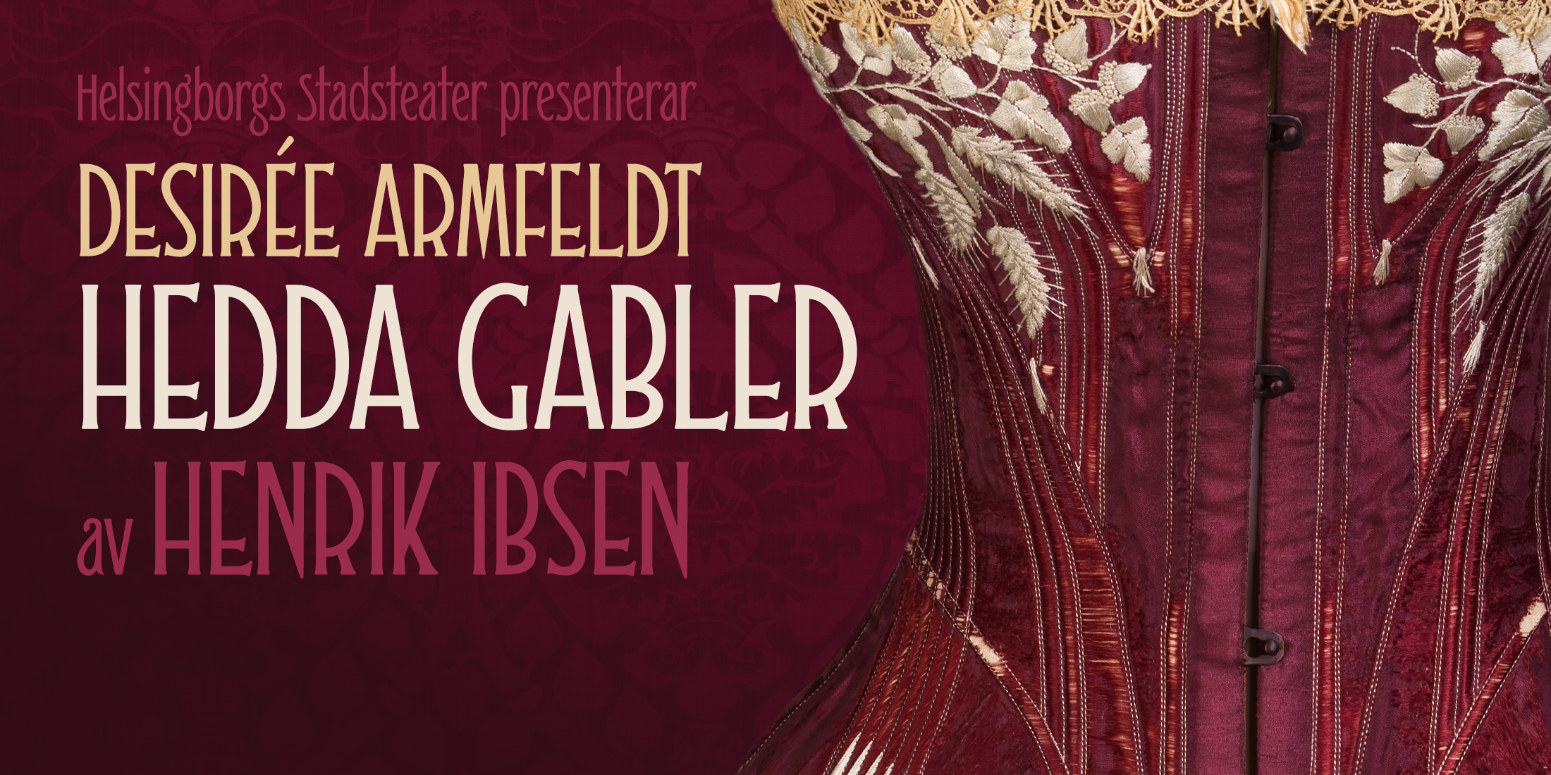
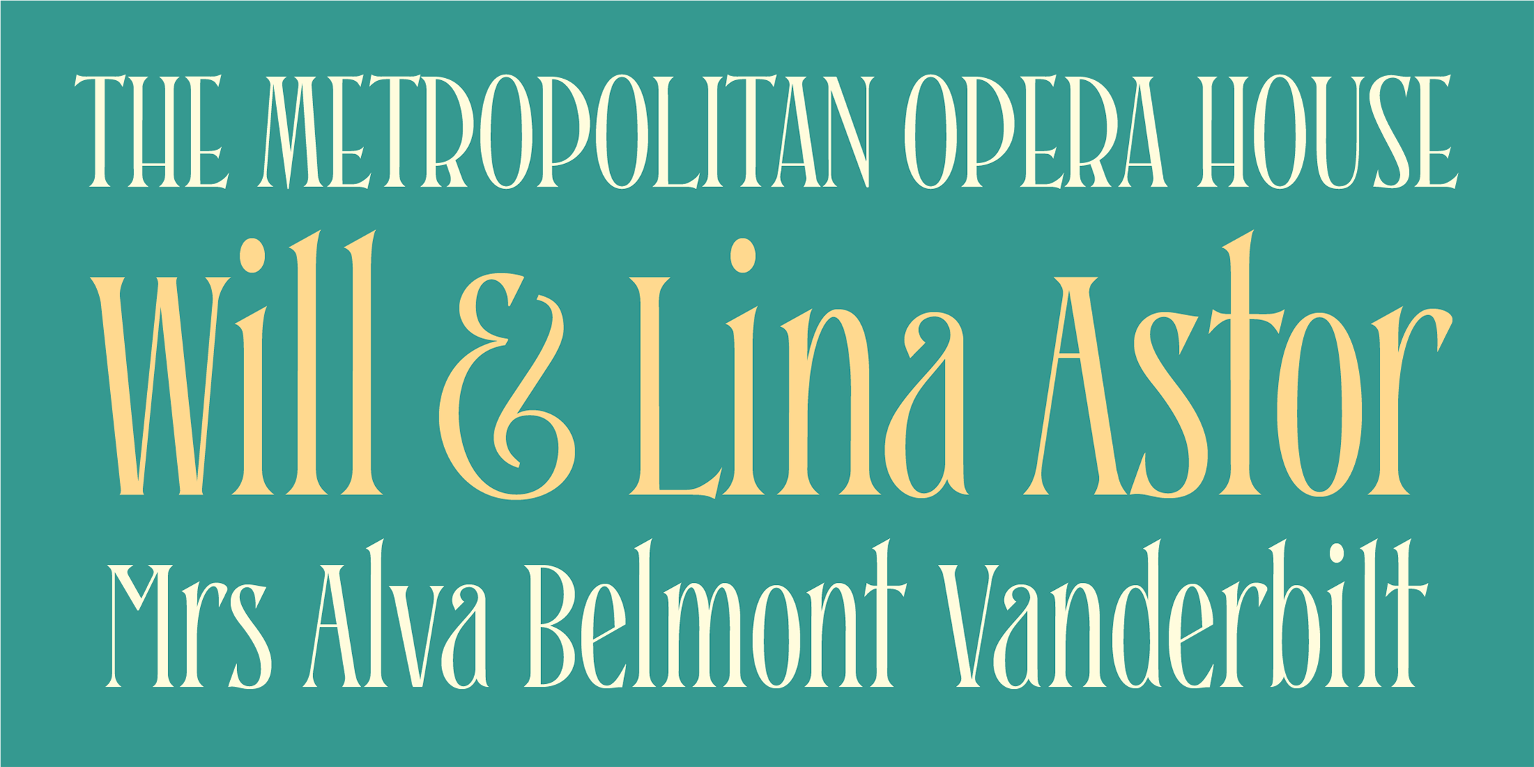
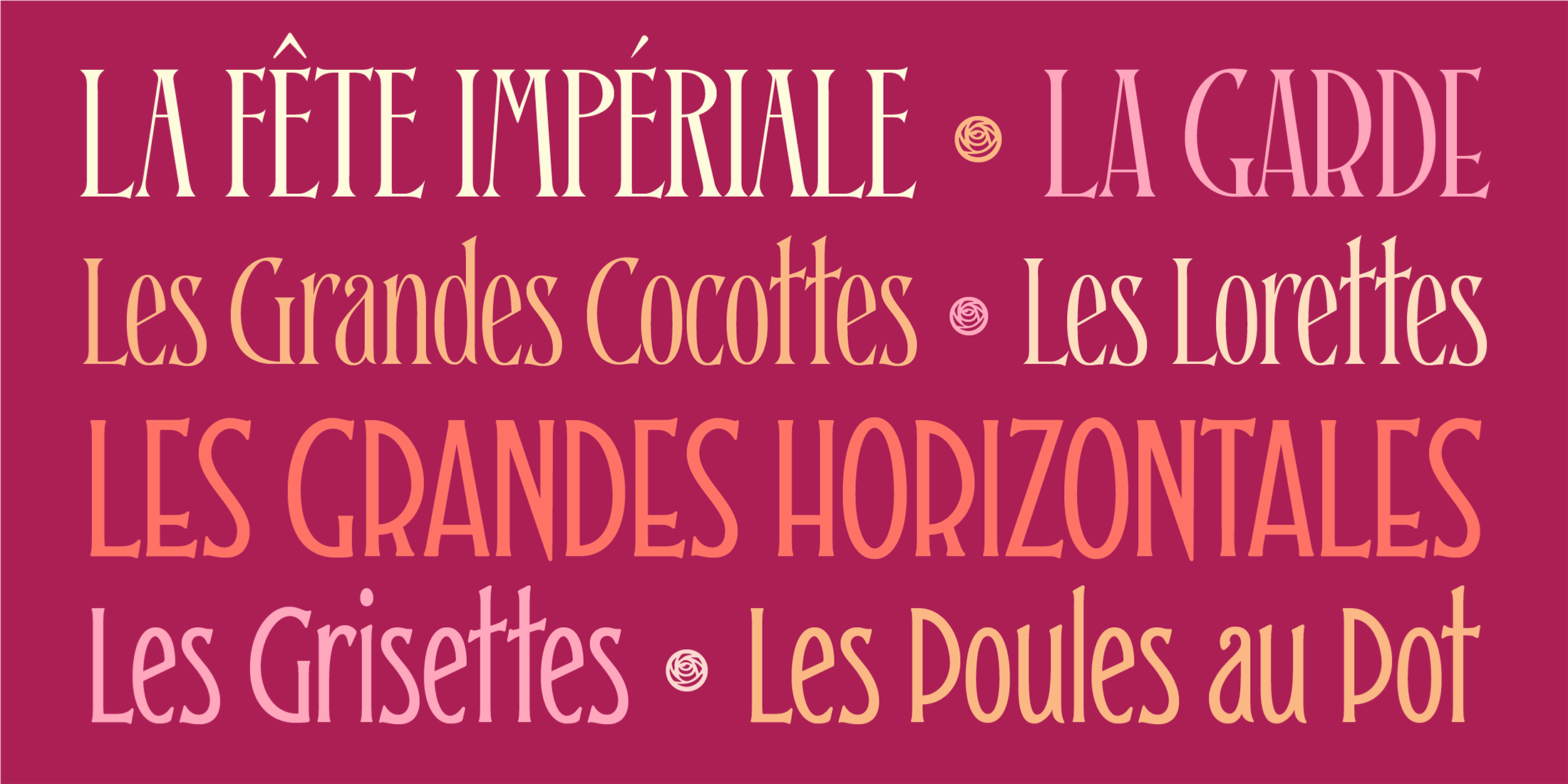
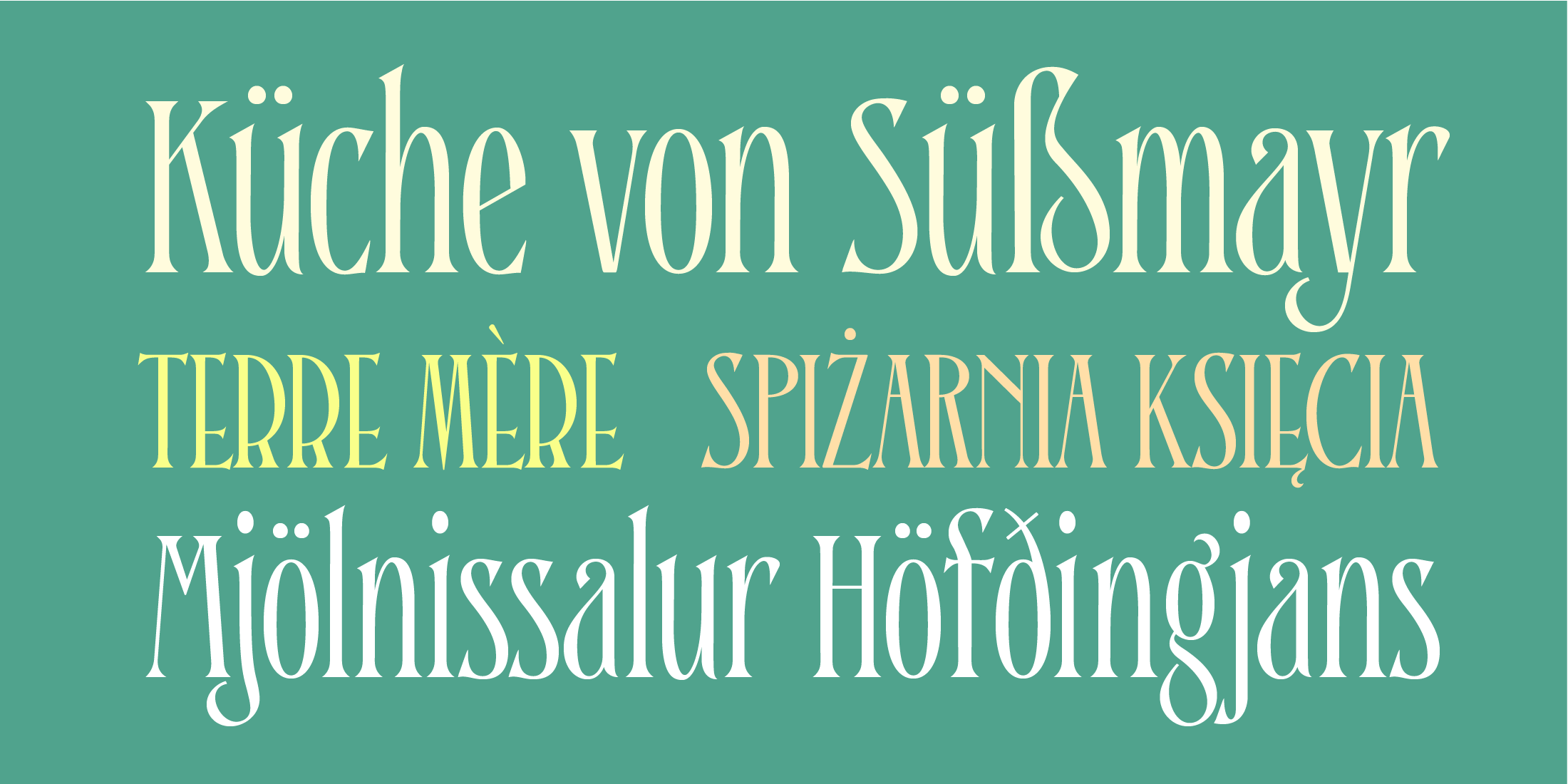
When you design a lot of display pieces, you’re often in need of tall, slim type. Liaisons provides that, in a distinct fin-de-siècle style inspired by the great posters of the Gilded Age from Sweden, Denmark, France, and Scotland. (The ampersand alone is a bit of a love letter to Charles Rennie Mackintosh!)
Both styles use the same slim skeleton, and are named after the stratum of society where one might find… a “dancing partner.”
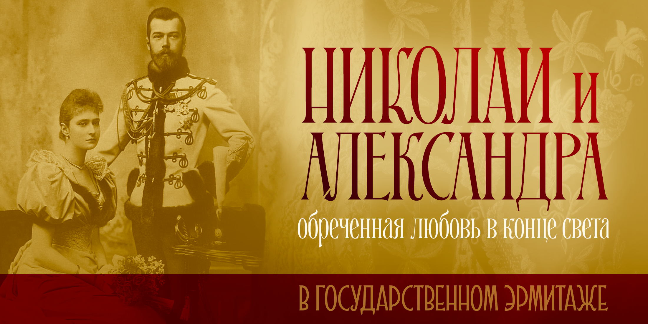
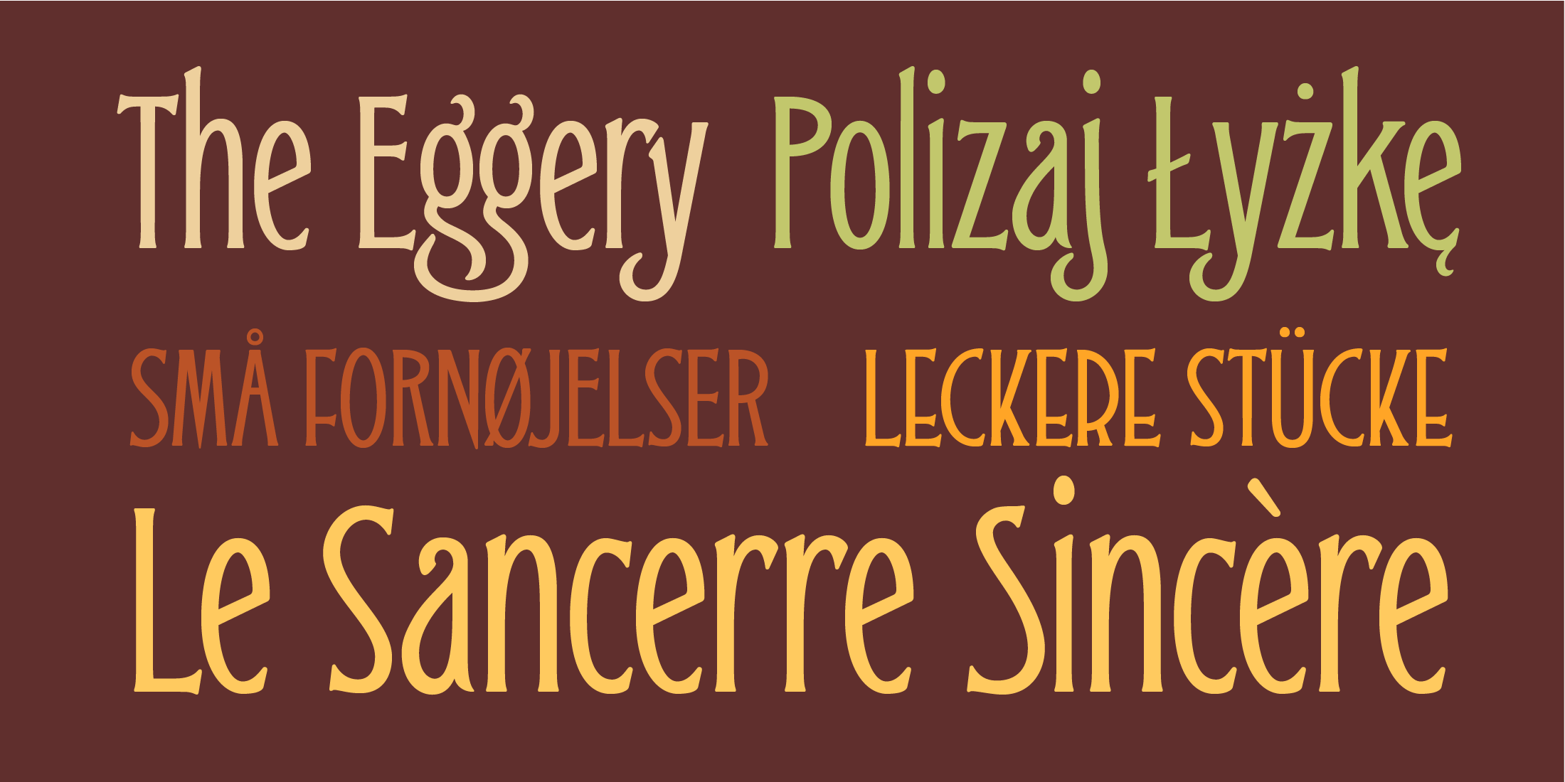
Both typefaces feature full Western and Eastern Latin character sets, as well as full Cyrillic/Slavic ones.
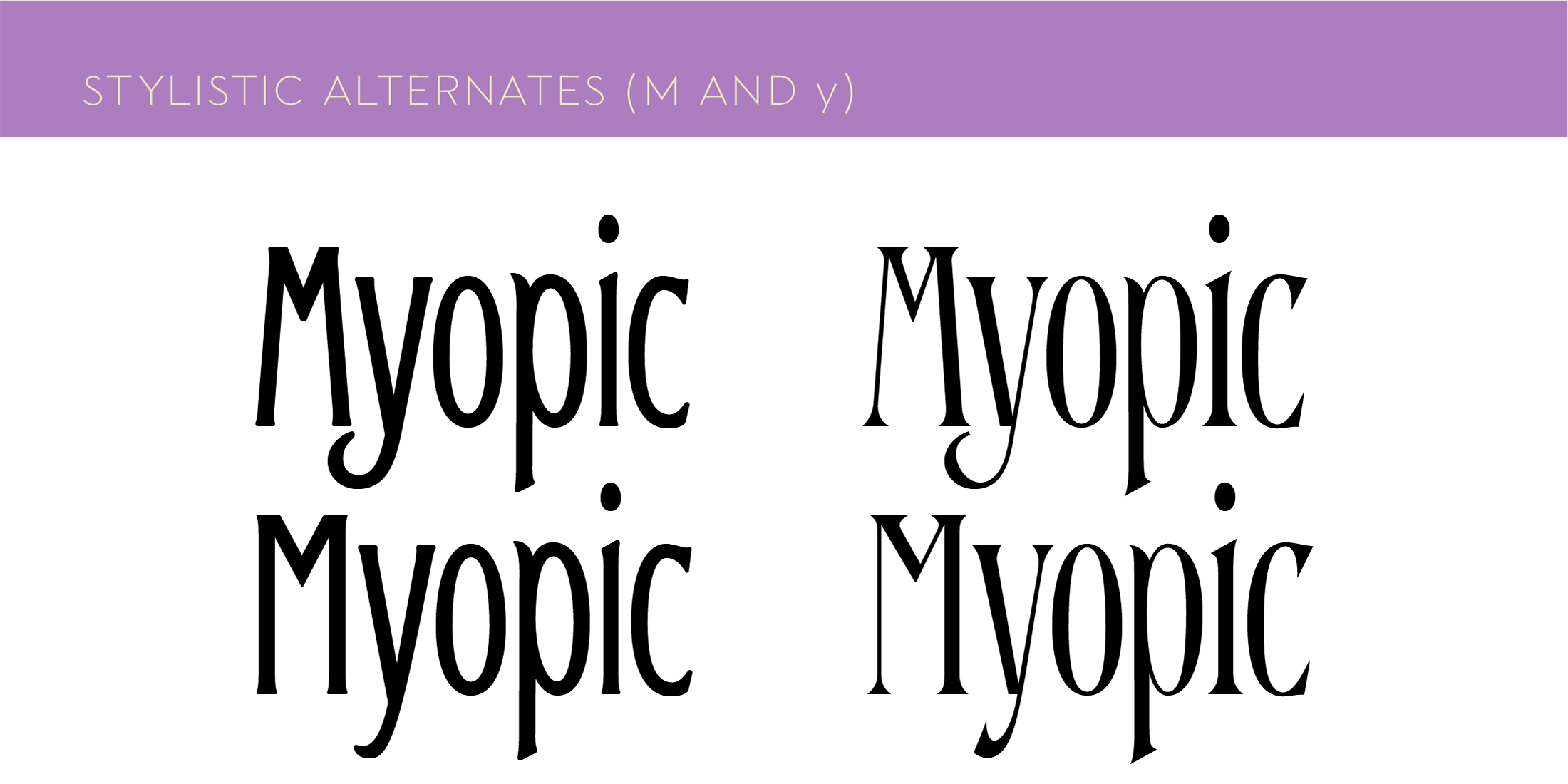
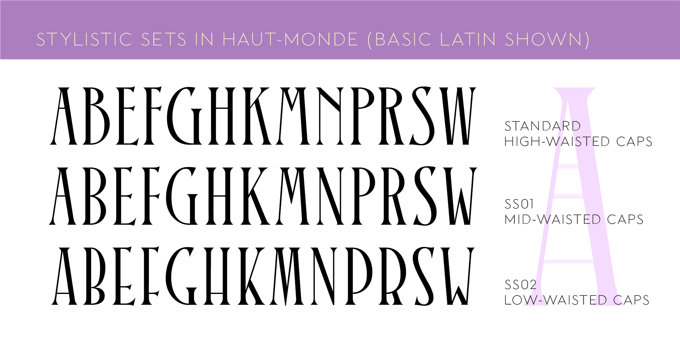
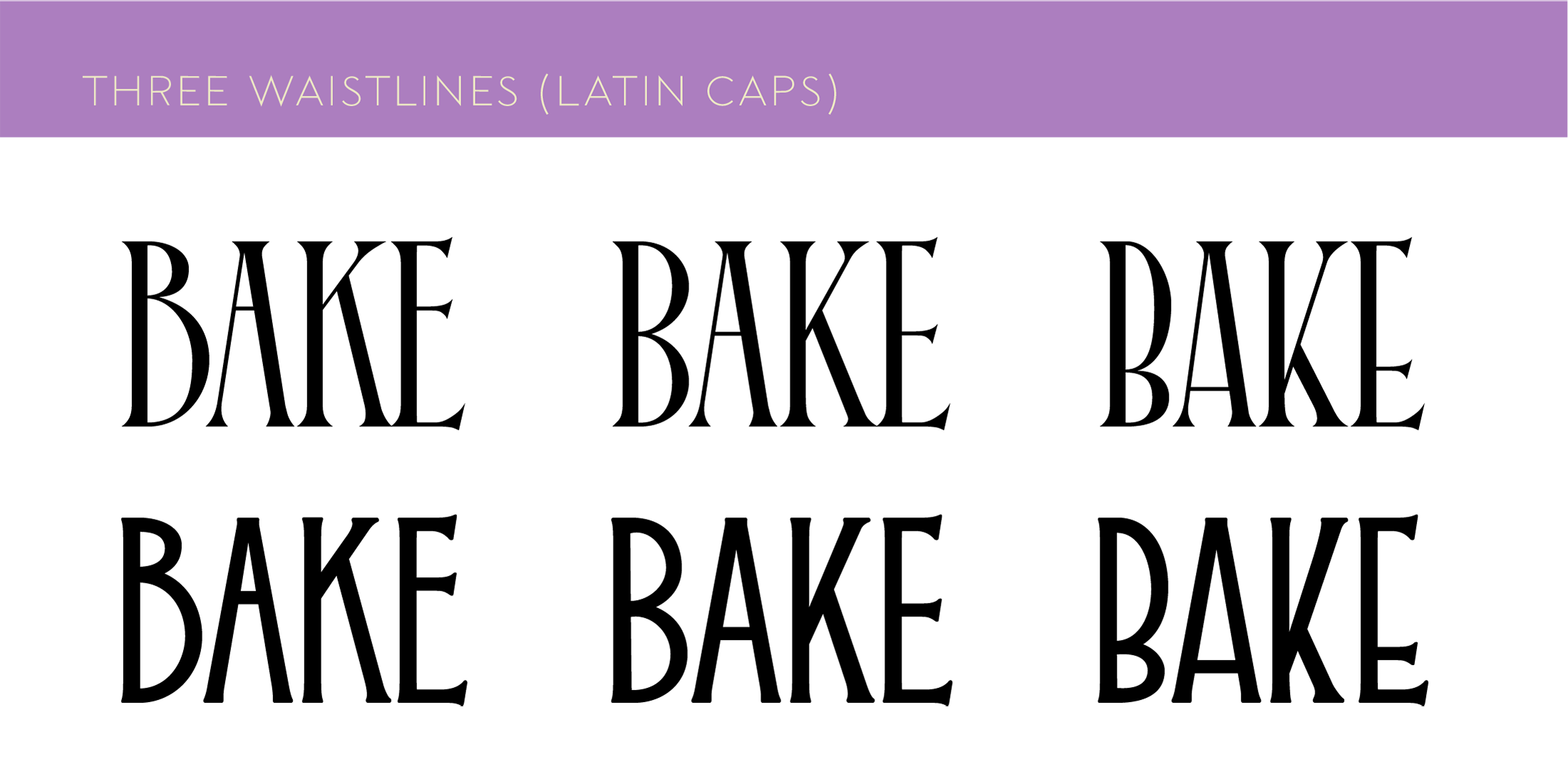
And, perhaps best of all, both typefaces feature capitals with high, middle, and low waists, so you can change up the look as you see fit!