A typewriter family that really works.
The typewriter gave us the dominant document body copy look for much of the 20th century. This is especially true of scripts — whether for stage or screen. In the entertainment industry, Courier is still the industry standard for scriptwriting.
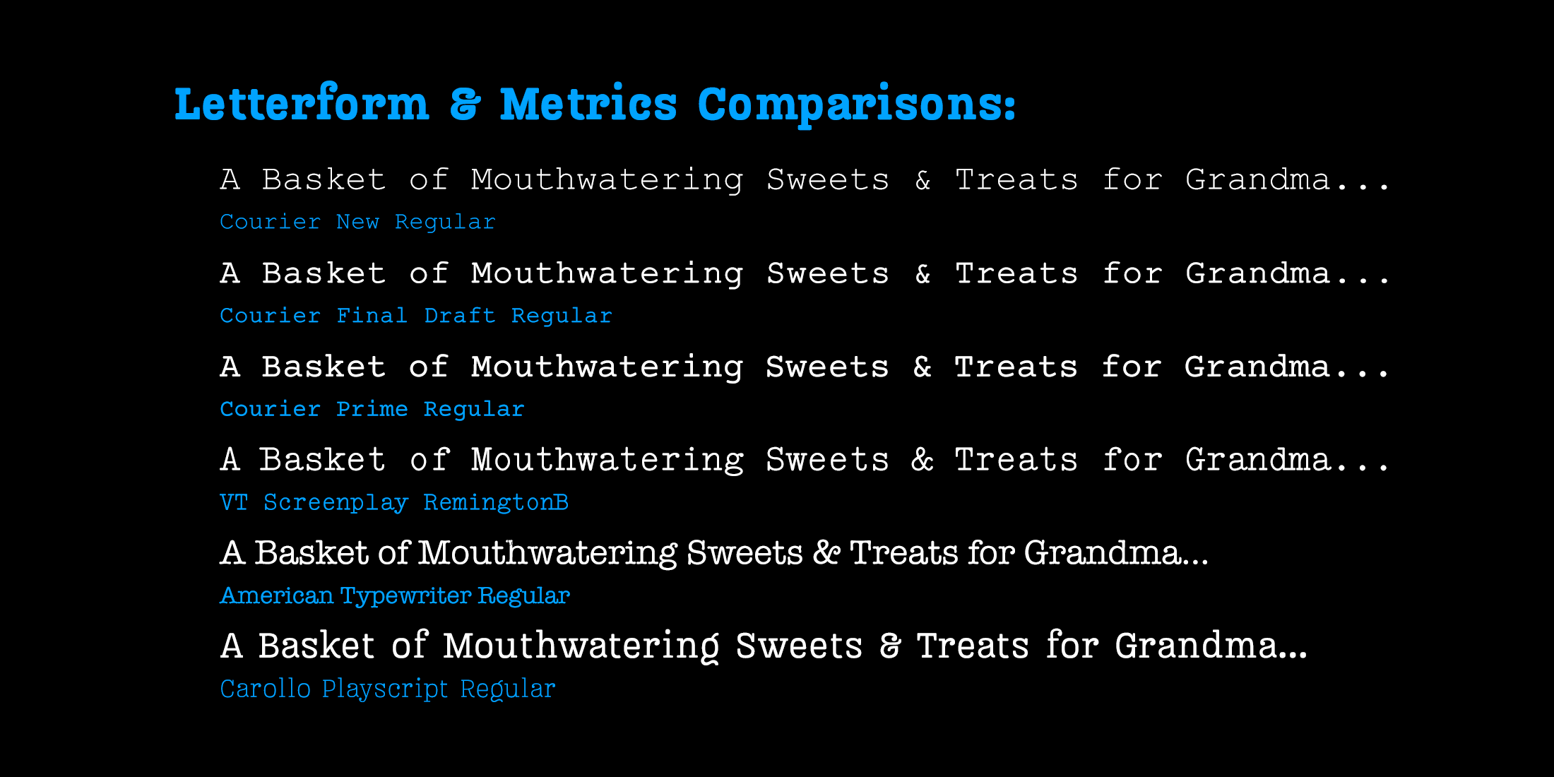
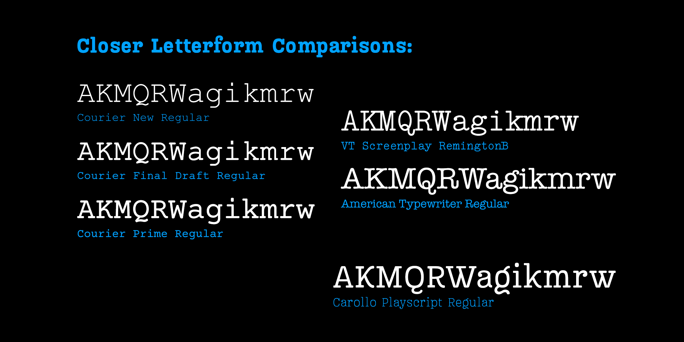
The problem is that Courier is ugly. Like all typewriter slabs, it's monospaced, so wide letters like m and w are cramped into the same horizontal space as narrow letters like i and l, which are forced to have exceptionally large serifs to fill the same space. More than that, standard digital versions of Courier are too light for effective reading under stressful performance conditions.
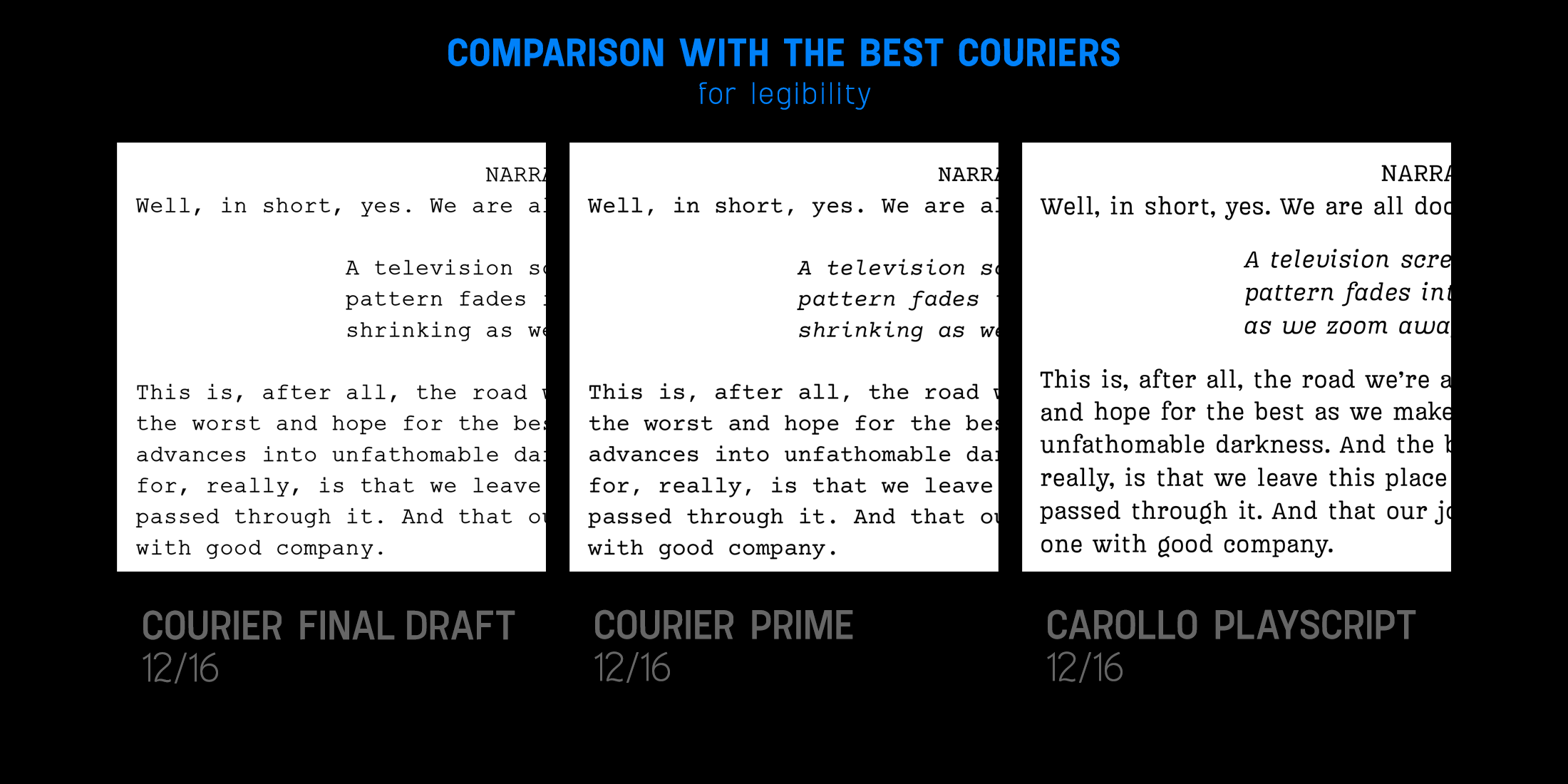
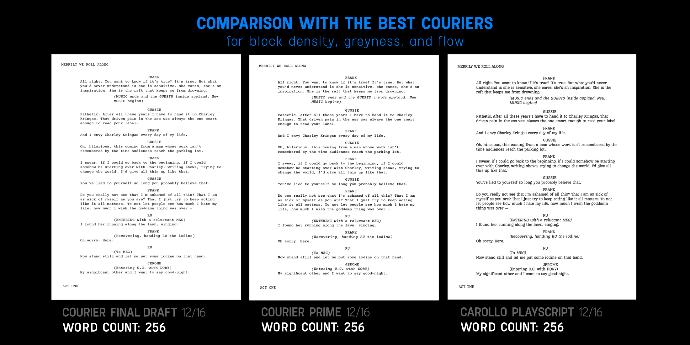
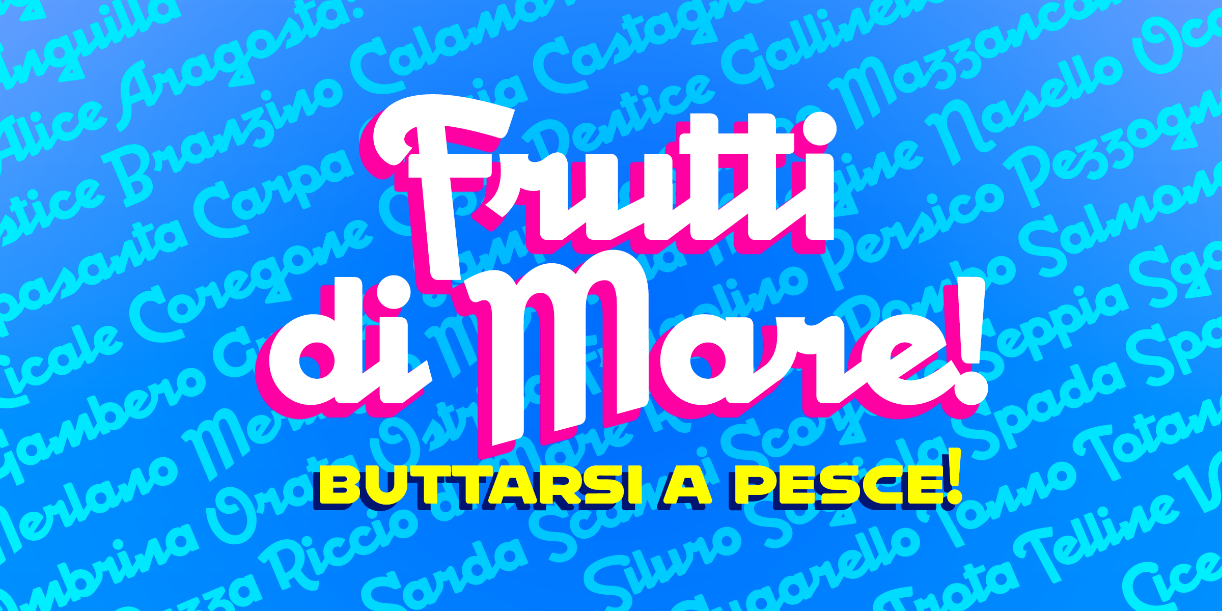
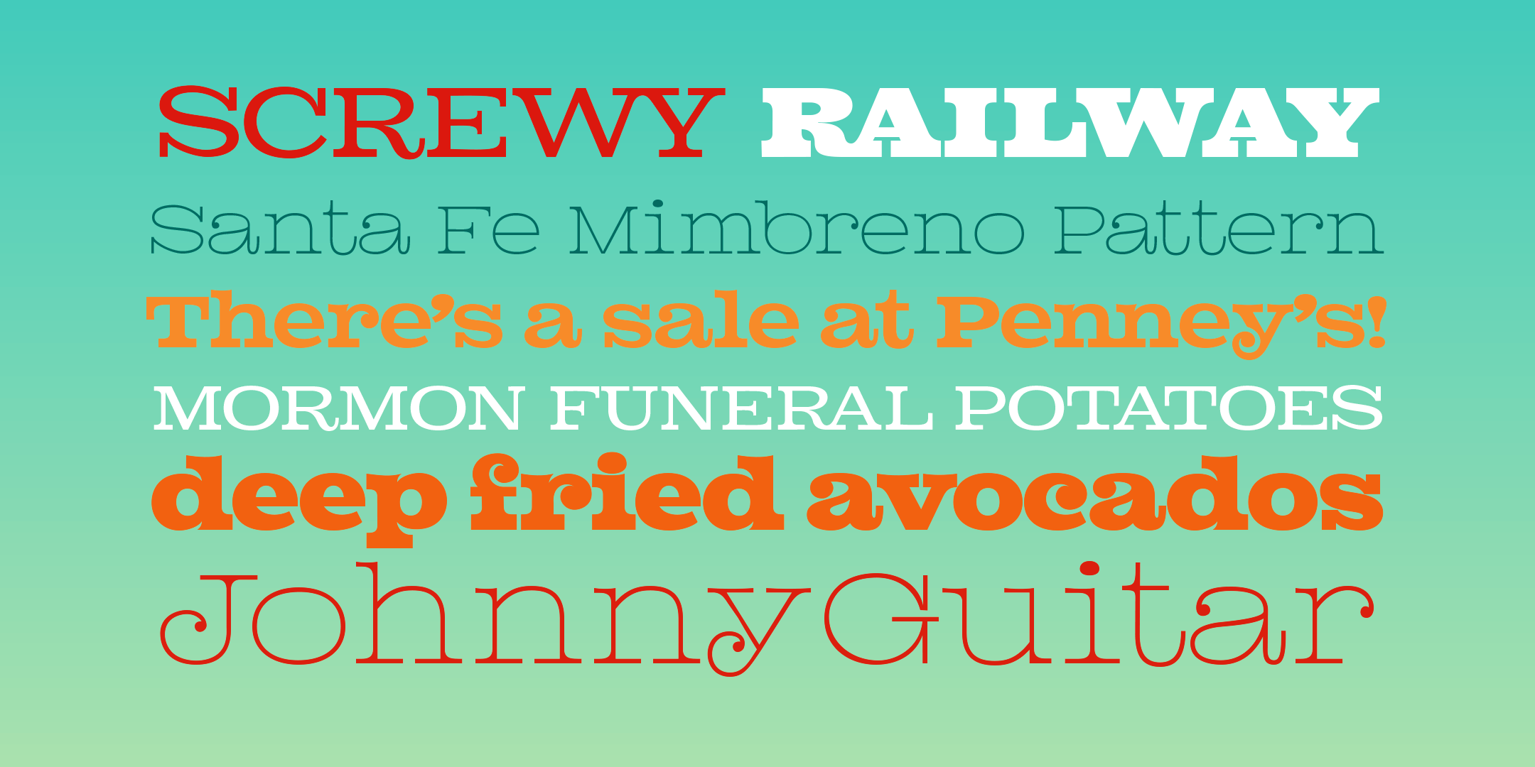
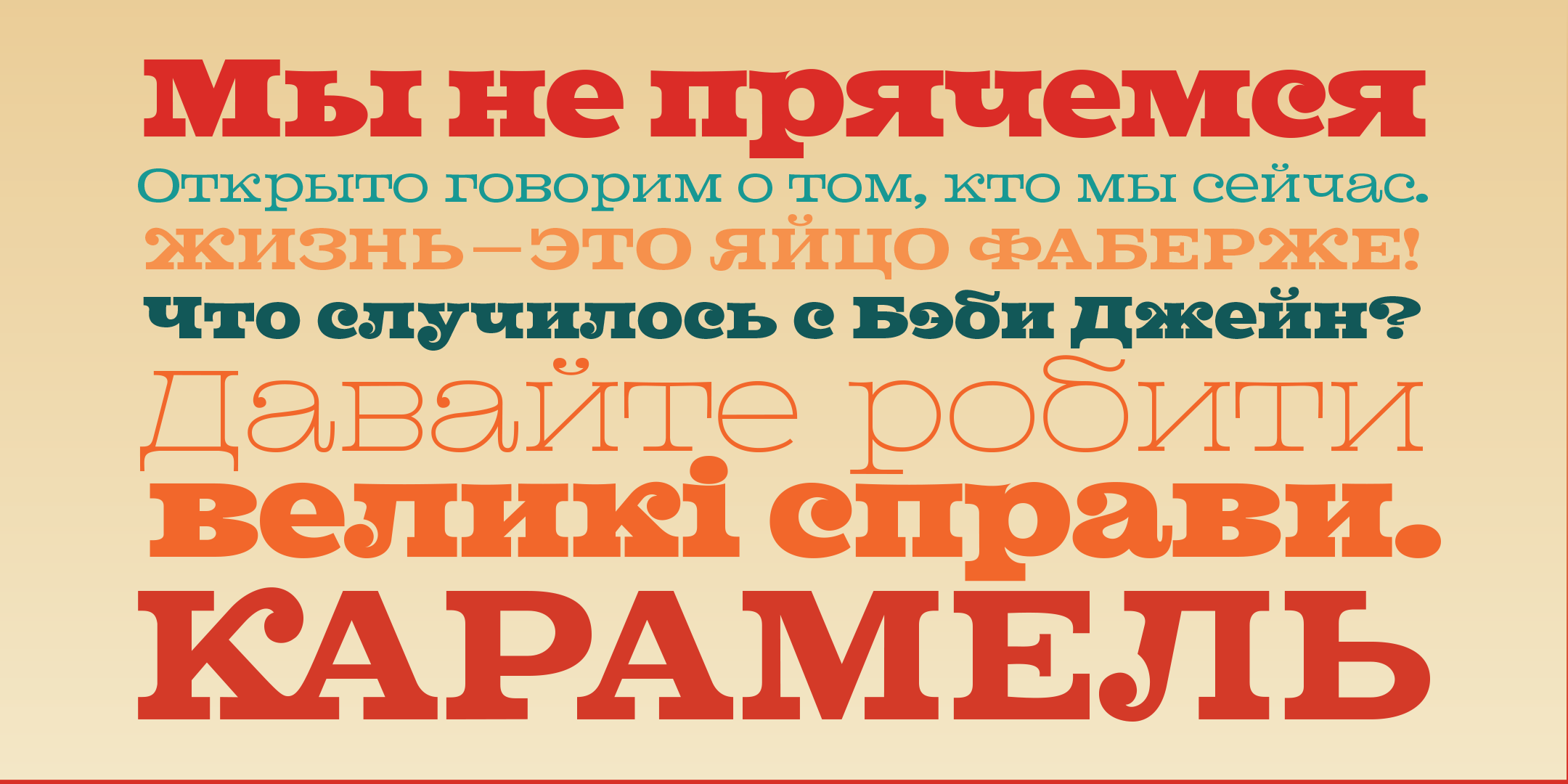
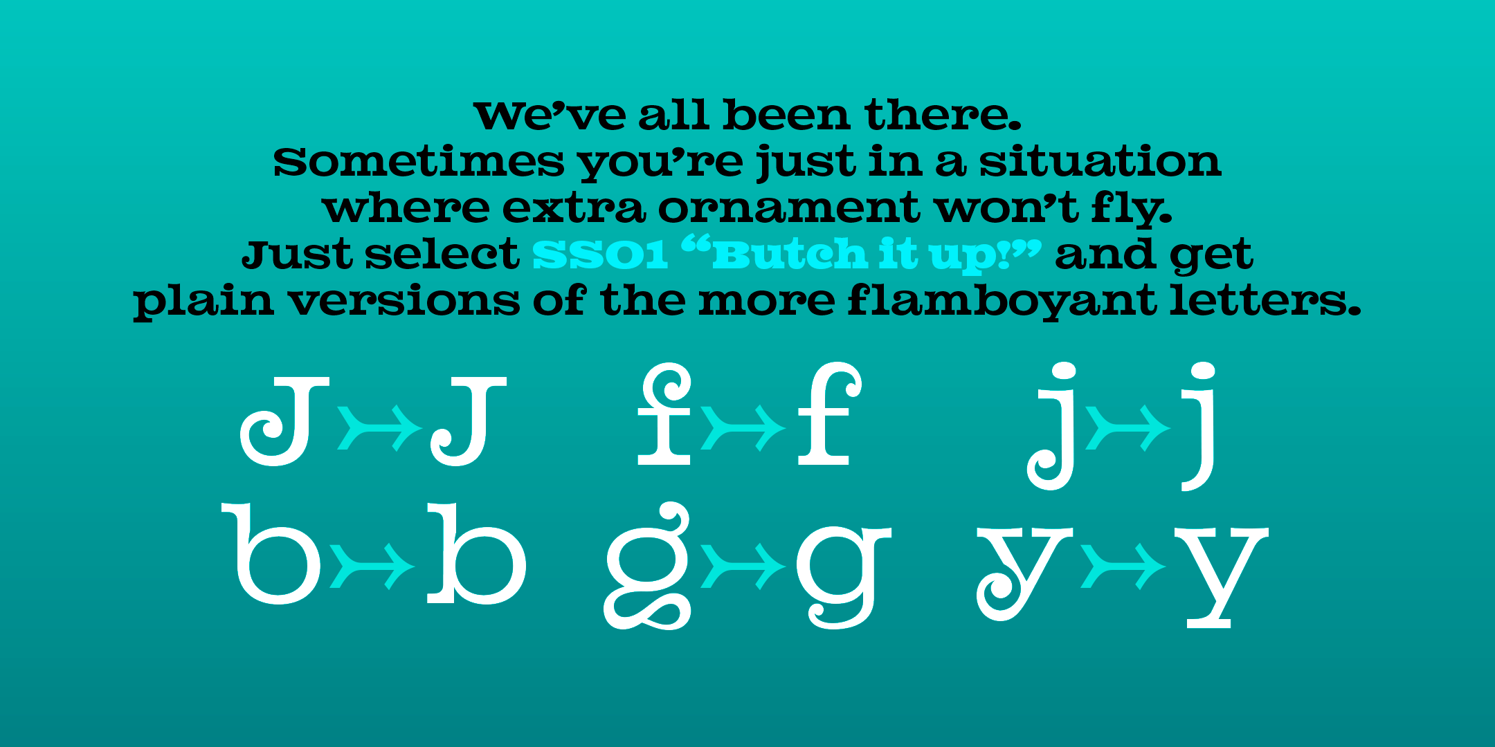
Enter Carollo Playscript. Carollo Playscript has the charm, height, and punch of a classic typewriter slab serif with the versatility, proportions, legibility, readability, and poise of a workhorse serif family. Its high x-height and recognizable letterforms gives your talent and creatives a script that's more legible and readable. Unlike Courier, it has true italics to set directions and actions apart from dialogue. And it has three body weights—light, regular, and medium—to let you adjust the density of block text. It even has Greek and Cyrillic character sets. And, even though it's not perfectly fixed-width, it keeps the runtime-per-page pretty damned stable. That's a tradeoff very much worth making!
Only $120 for the whole family: 20% off the distributor price!
A typewriter family that really works.
The typewriter gave us the dominant document body copy look for much of the 20th century. This is especially true of scripts — whether for stage or screen. In the entertainment industry, Courier is still the industry standard for scriptwriting.
The problem is that Courier is ugly. Like all typewriter slabs, it's monospaced, so wide letters like m and w are cramped into the same horizontal space as narrow letters like i and l, which are forced to have exceptionally large serifs to fill the same space. More than that, standard digital versions of Courier are too light for effective reading under stressful performance conditions.
Enter Carollo Playscript. Carollo Playscript has the charm, height, and punch of a classic typewriter slab serif with the versatility, proportions, legibility, readability, and poise of a workhorse serif family. Its high x-height and recognizable letterforms gives your talent and creatives a script that's more legible and readable. Unlike Courier, it has true italics to set directions and actions apart from dialogue. And it has three body weights—light, regular, and medium—to let you adjust the density of block text. It even has Greek and Cyrillic character sets. And, even though it's not perfectly fixed-width, it keeps the runtime-per-page pretty damned stable. That's a tradeoff very much worth making!
Only $120 for the whole family: 20% off the distributor price!

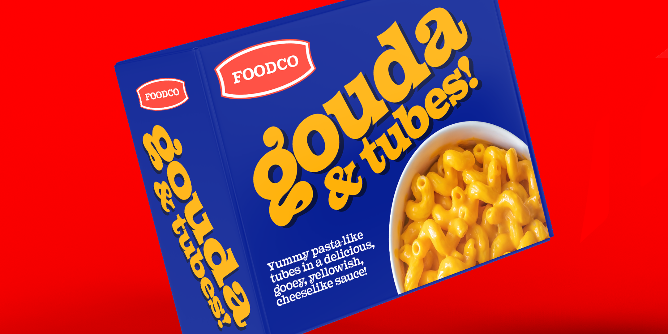
 Image 1 of 8
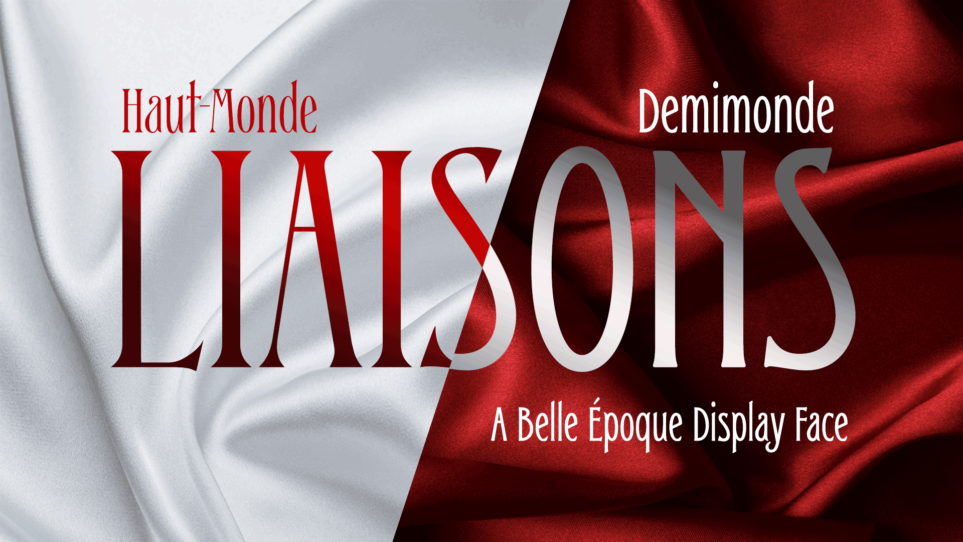
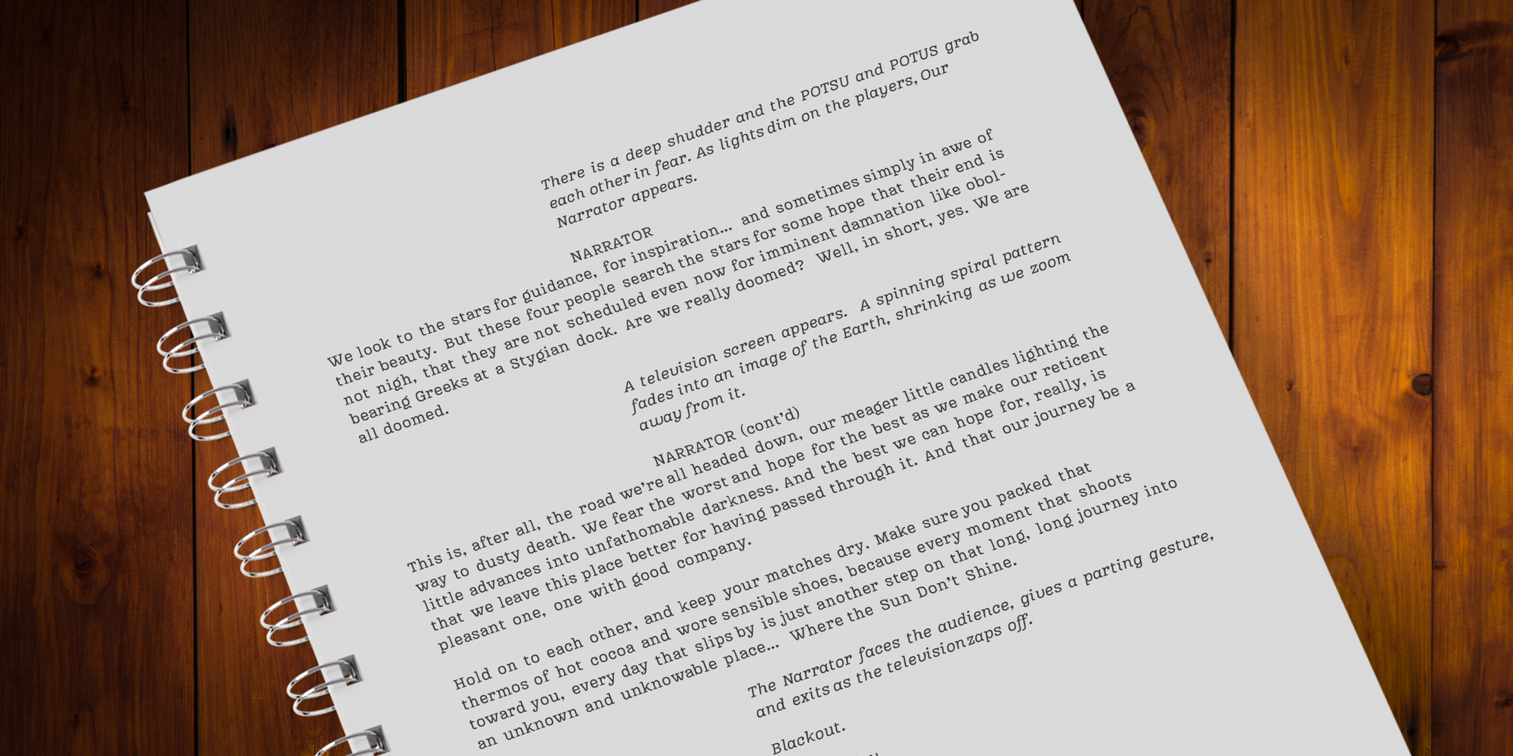 Image 2 of 8
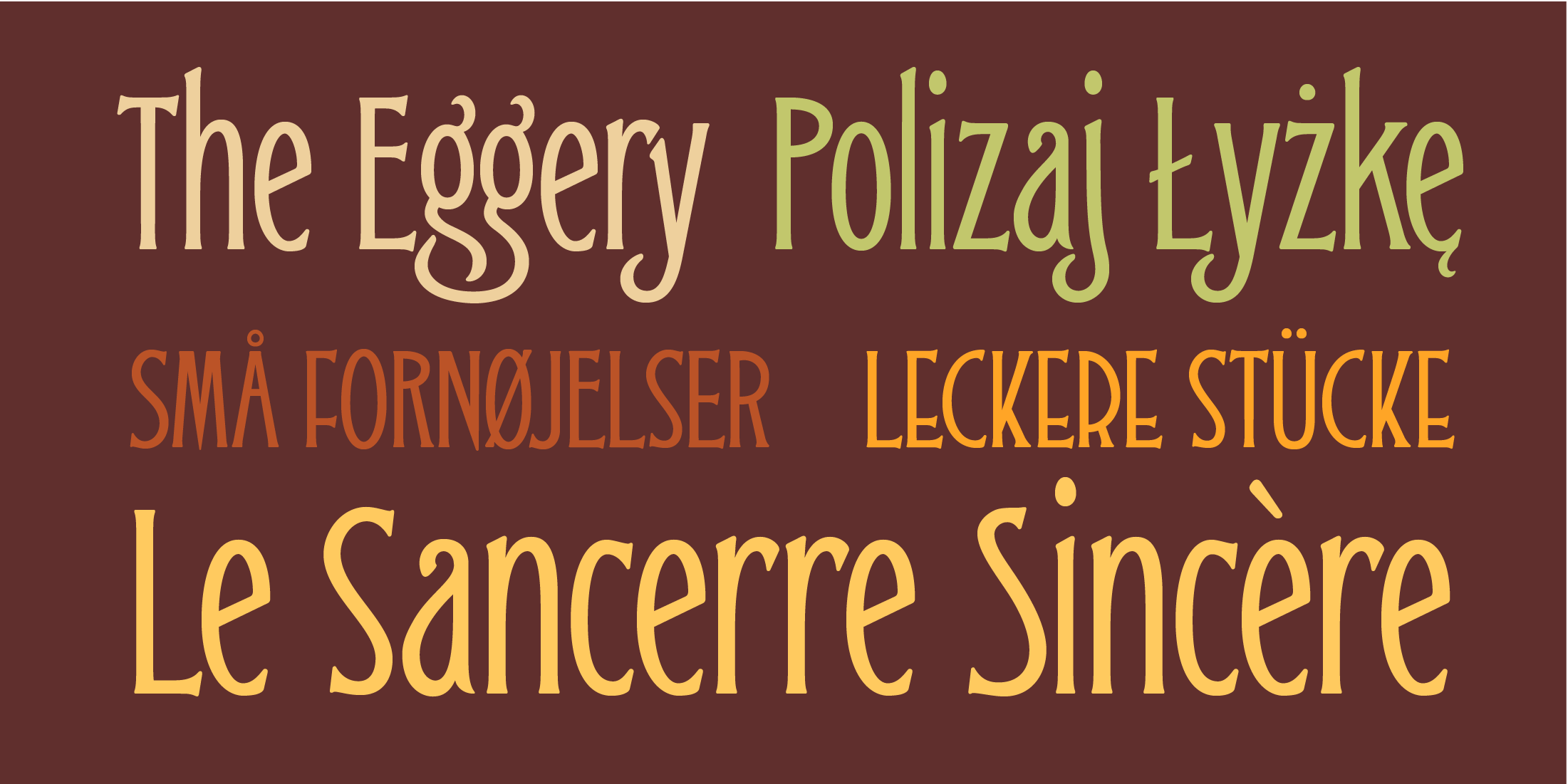
 Image 3 of 8
 Image 4 of 8
 Image 5 of 8
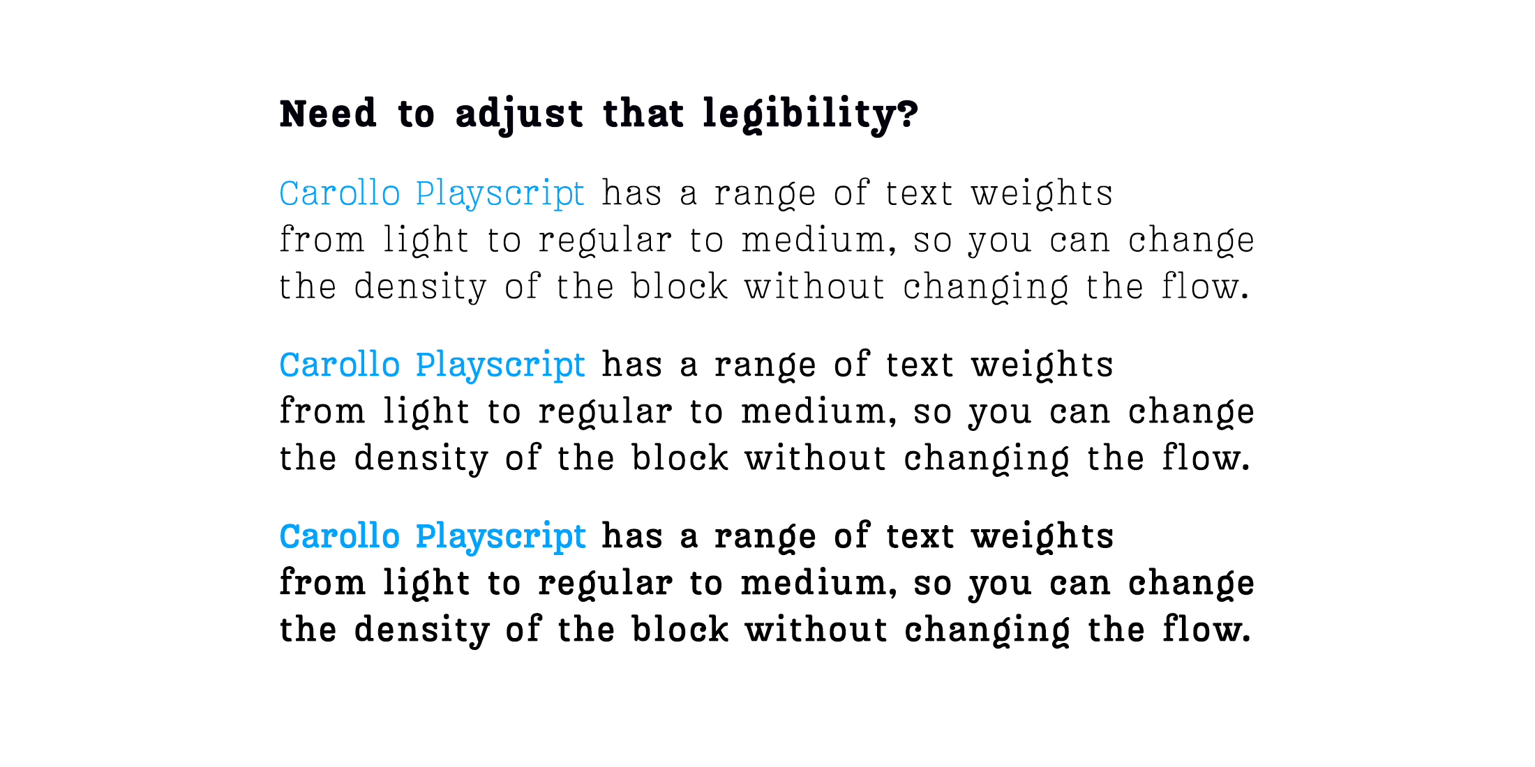 Image 6 of 8
 Image 7 of 8
 Image 8 of 8