

Don’t be a stranger —
Drop a line for more info or inquiries about custom type!
Drop a line for more info or inquiries about custom type!

display
headline
modern/geometric
sans serif
text
Latin (Western Europe)
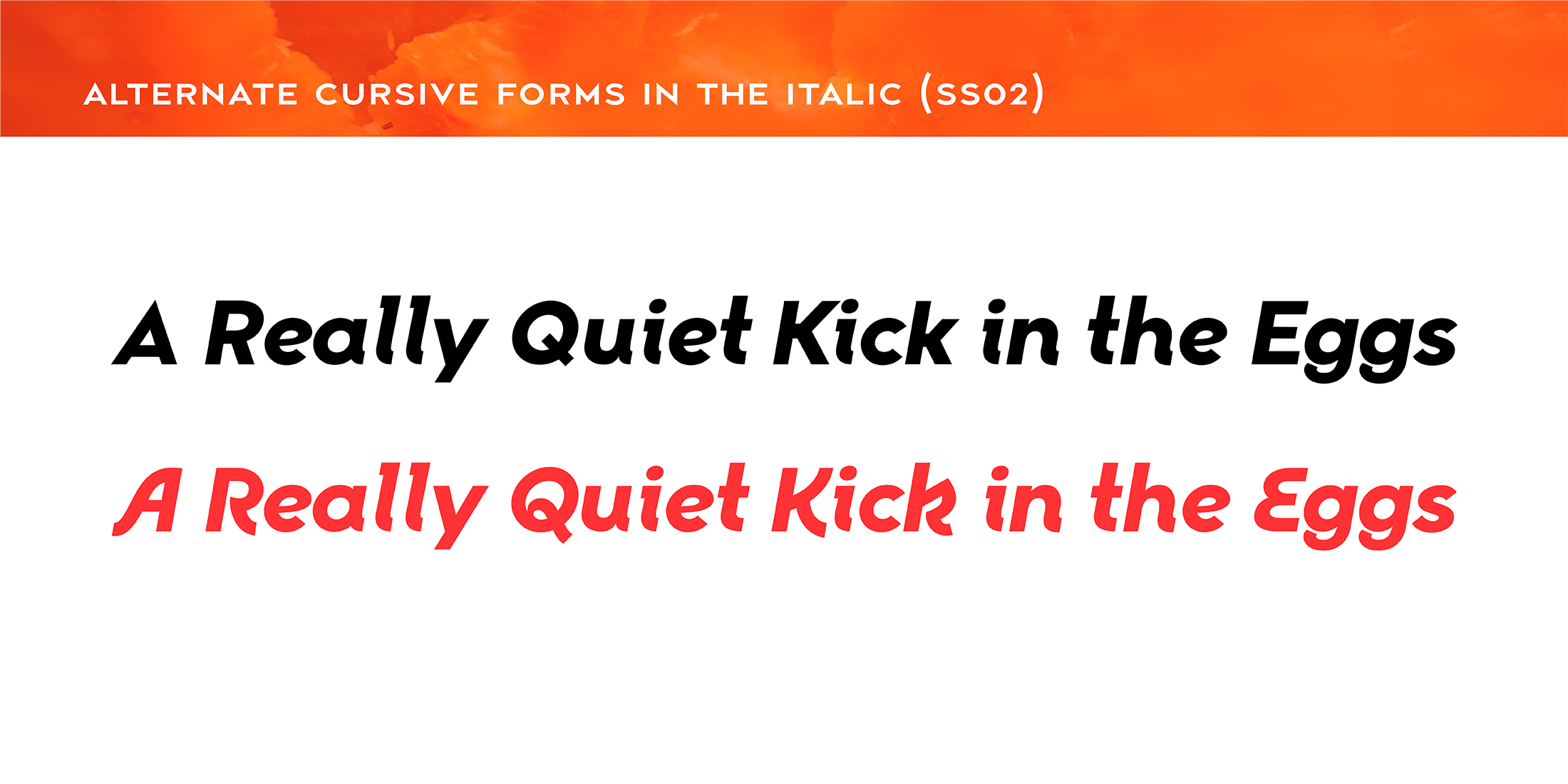
alternate characters
discretionary ligatures
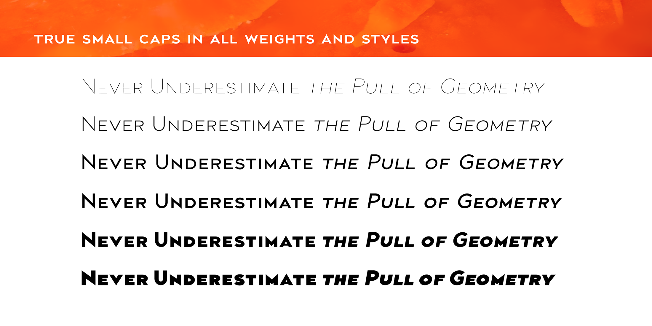
small caps
stylistic sets
swash caps
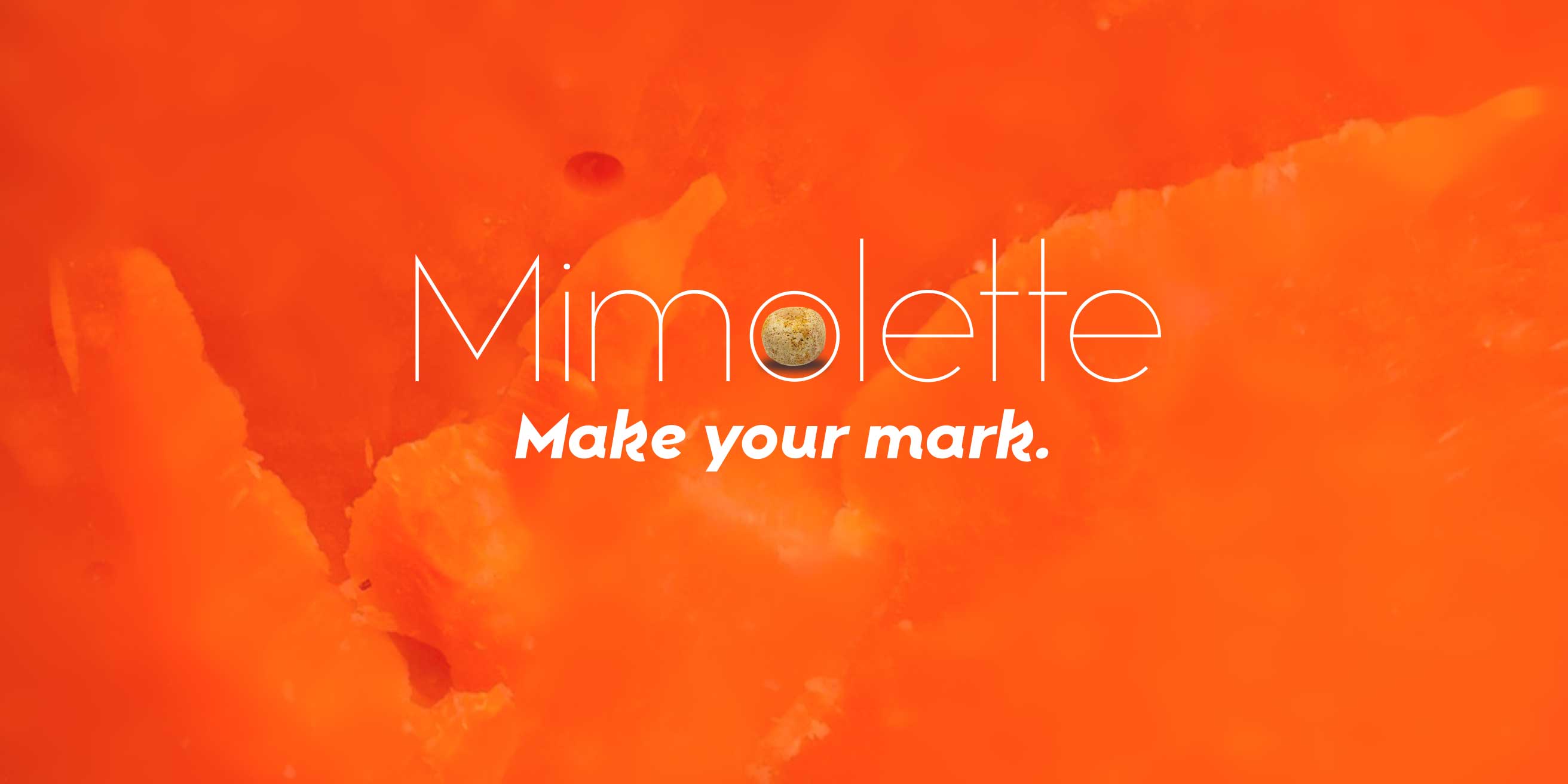
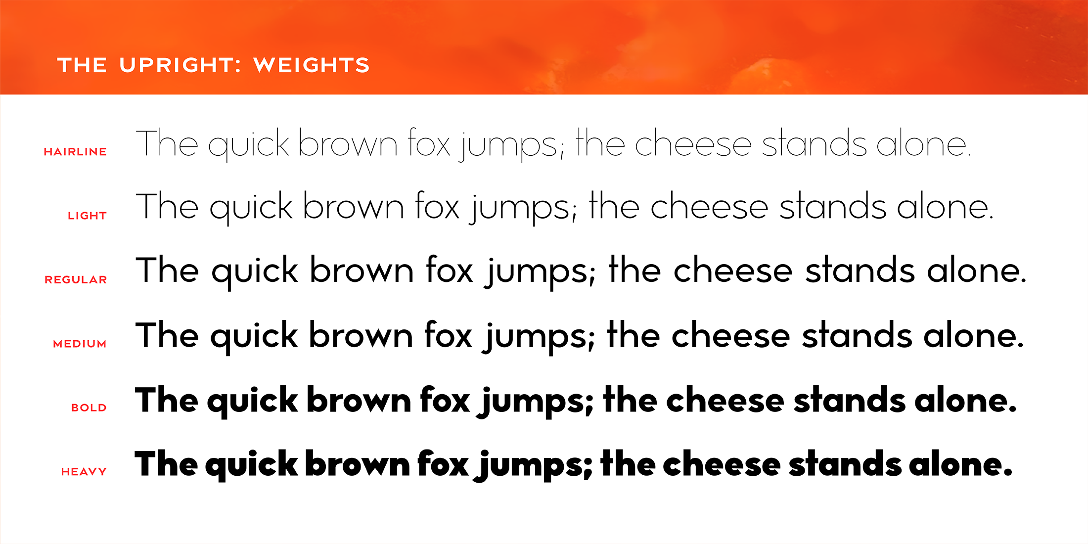
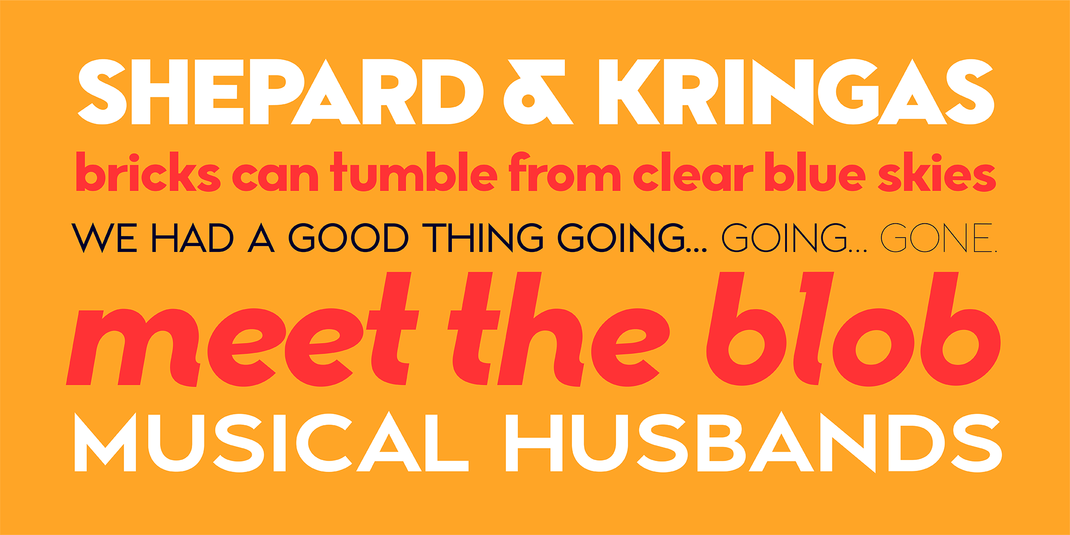
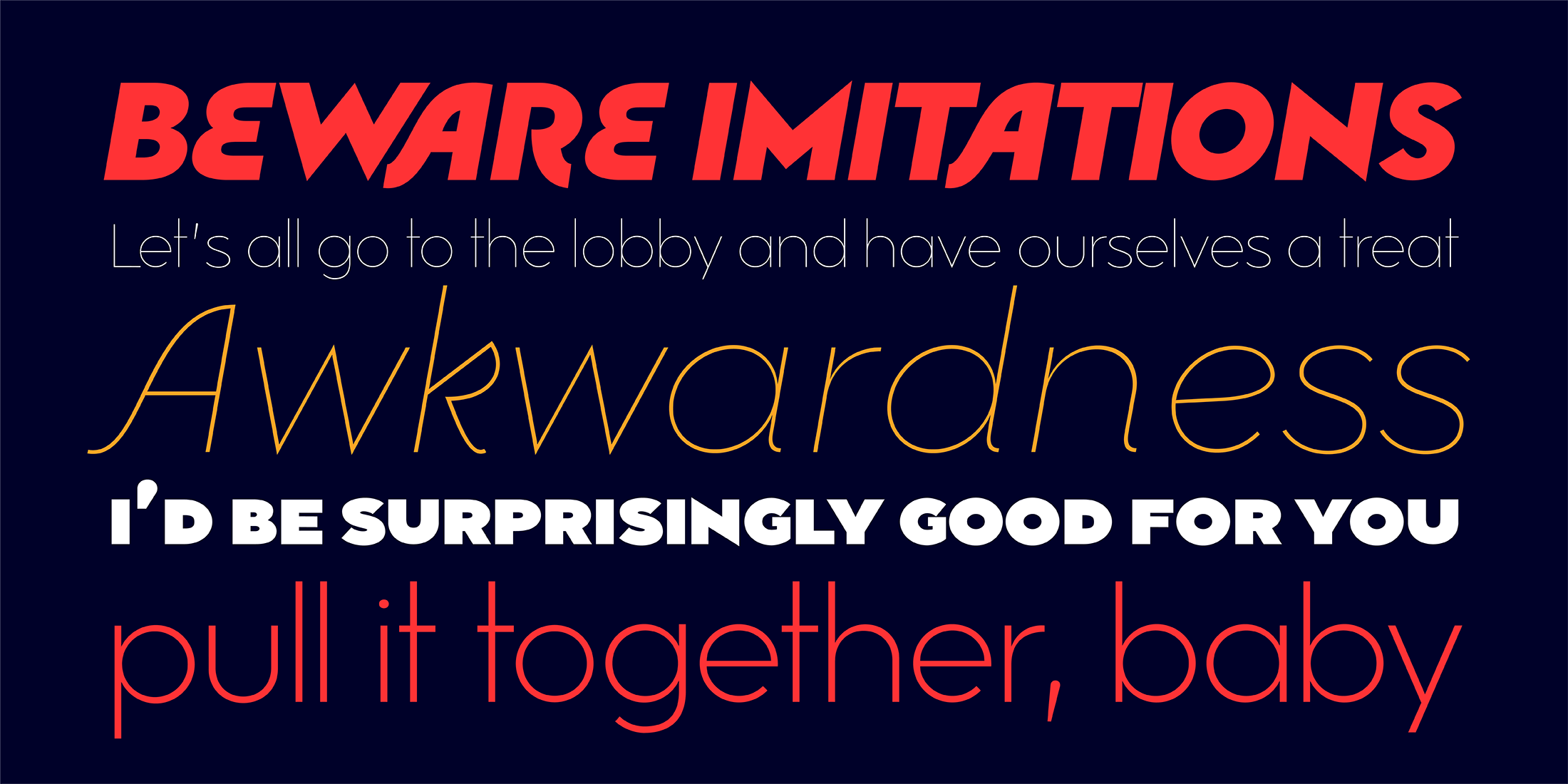
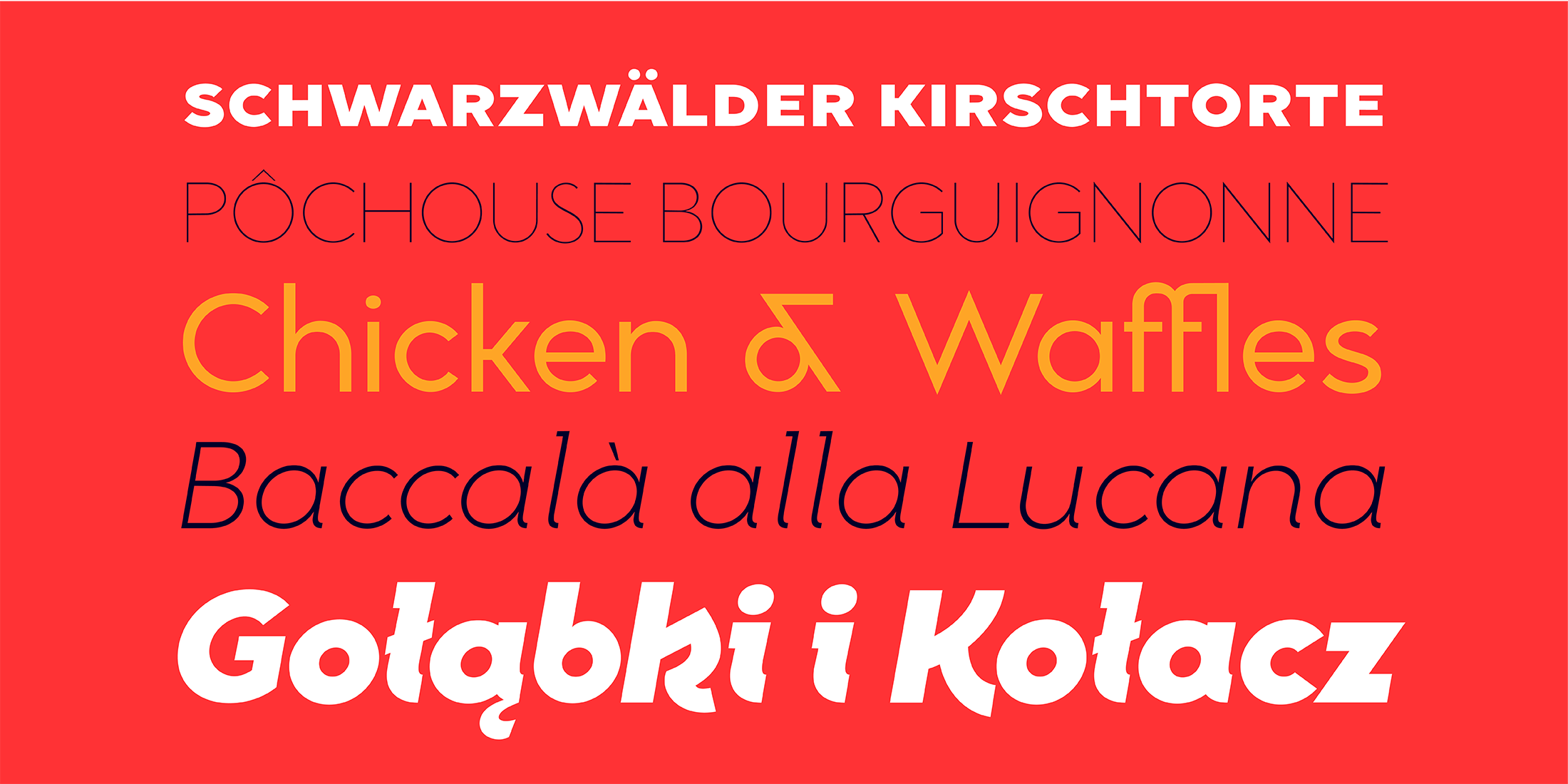
Mimolette offers a sans serif family that's great for text and display alike—the panache of Neutraface, the readability of Avenir, the sleekness of Avant Garde, the strength of Mark, the architecture of Gotham, and the classic lines of Futura—but she's entirely her own creature, and she's designed to offer maximum versatility and beauty at an affordable price.
And she's got some nifty features, too!