

Don’t be a stranger —
Drop a line for more info or inquiries about custom type!
Drop a line for more info or inquiries about custom type!
abstract
display
headline
Latin (Western Europe)
alternate characters
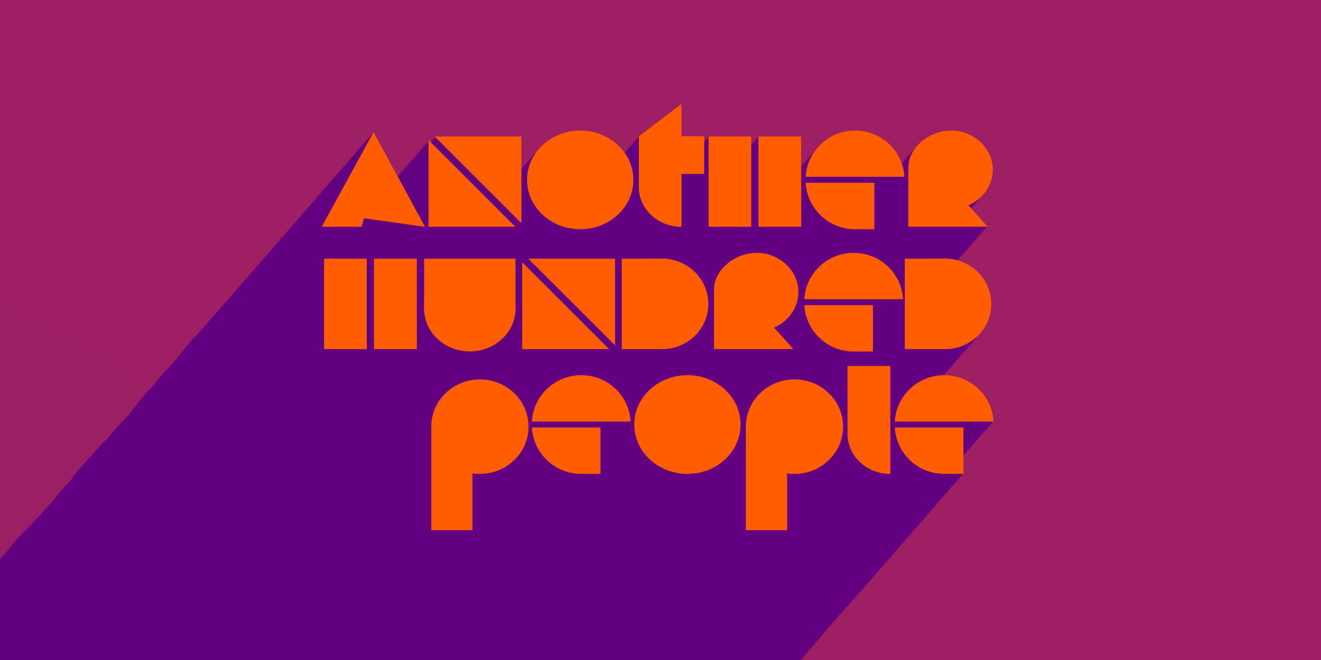
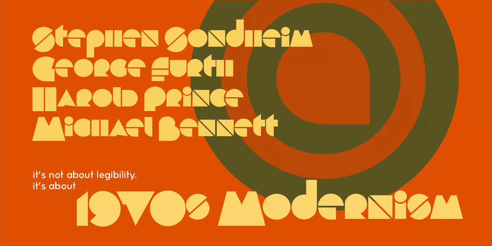
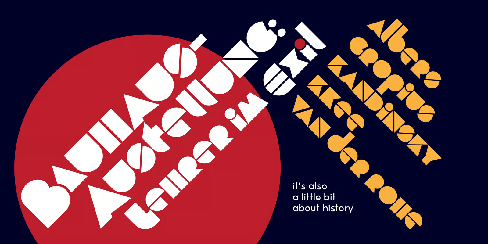
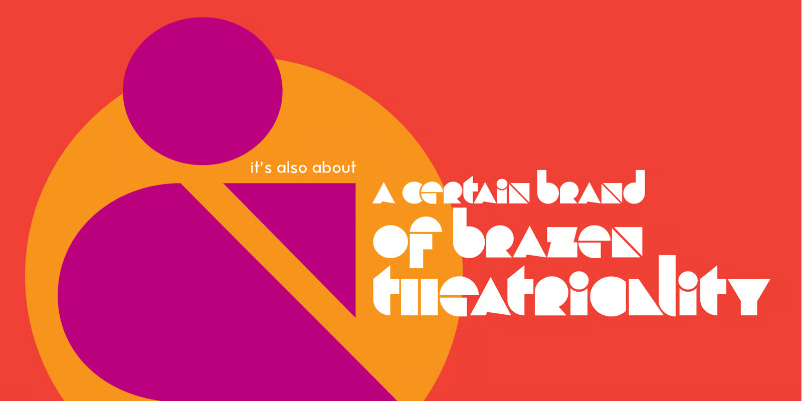
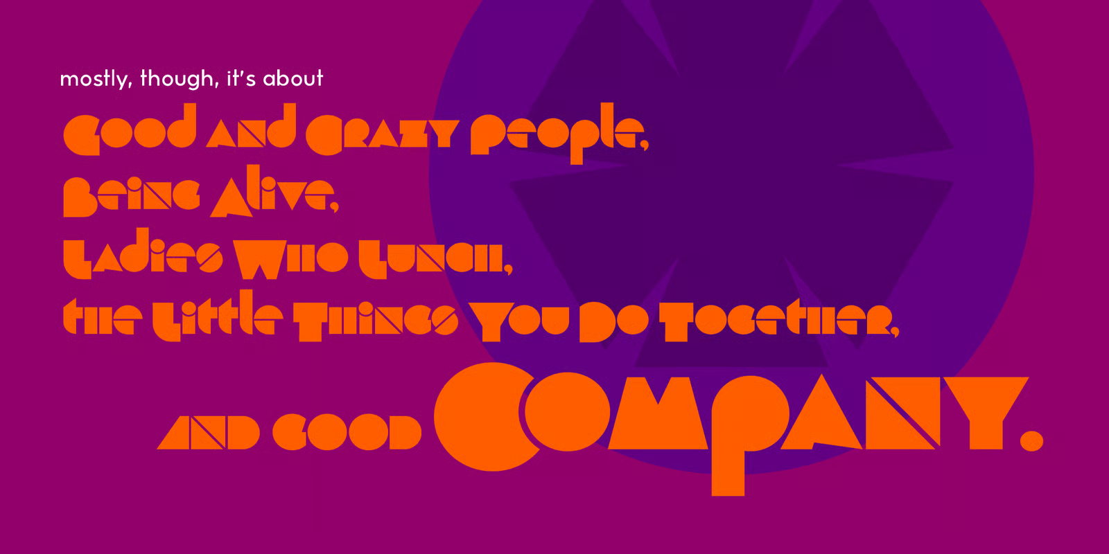
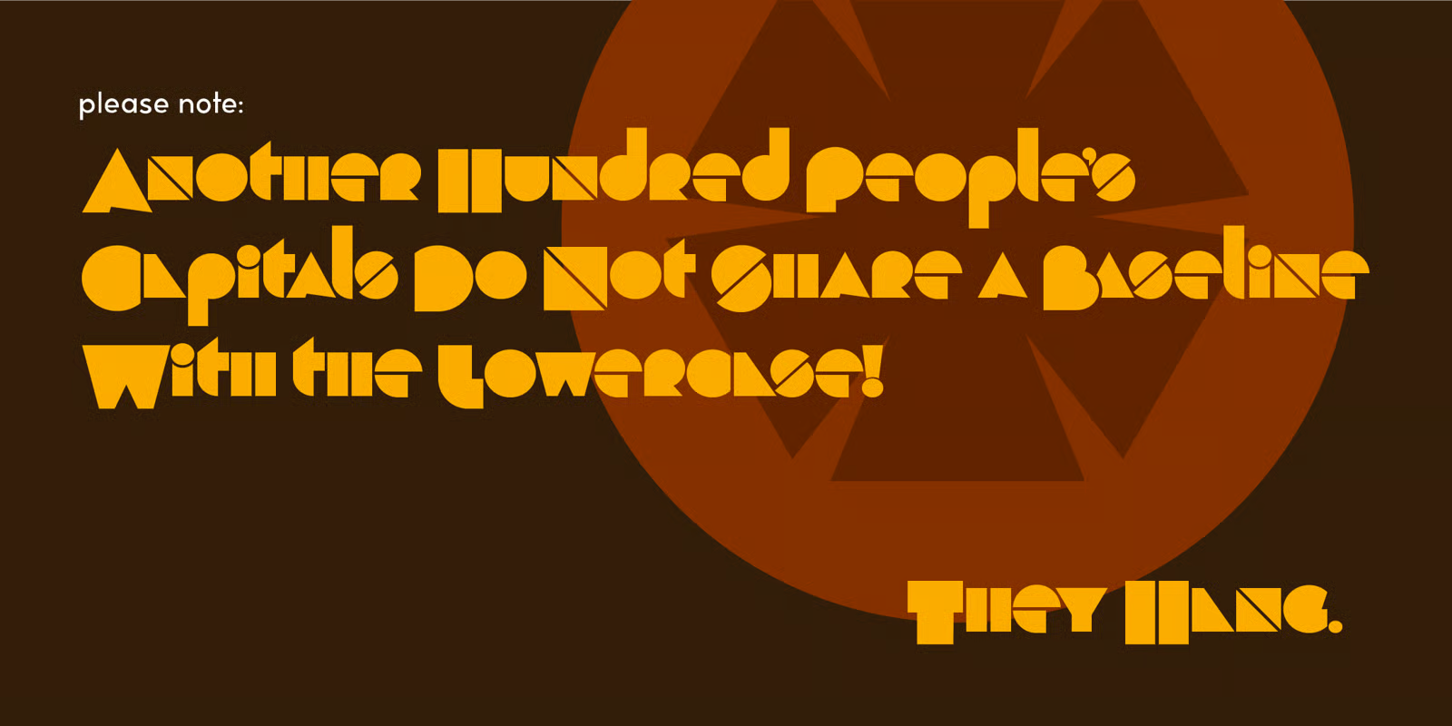
Inspired by the iconic letterforms in the key art for Stephen Sondheim's 1972 musical Company, Another Hundred People is a gleeful set of solid geometric glyphs — as though a set of Colorforms decided to express itself in words.
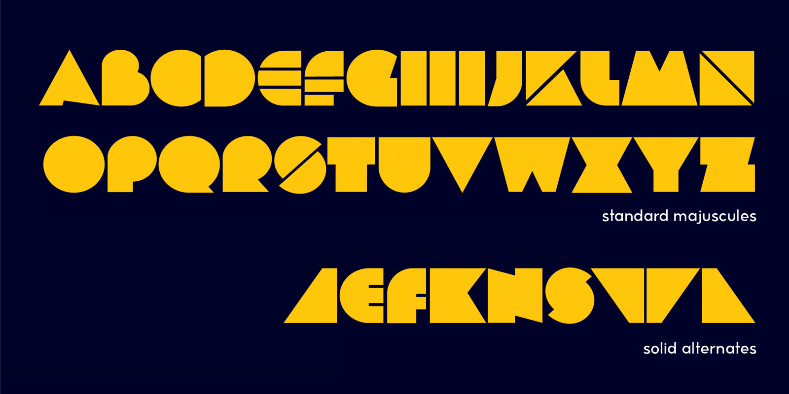
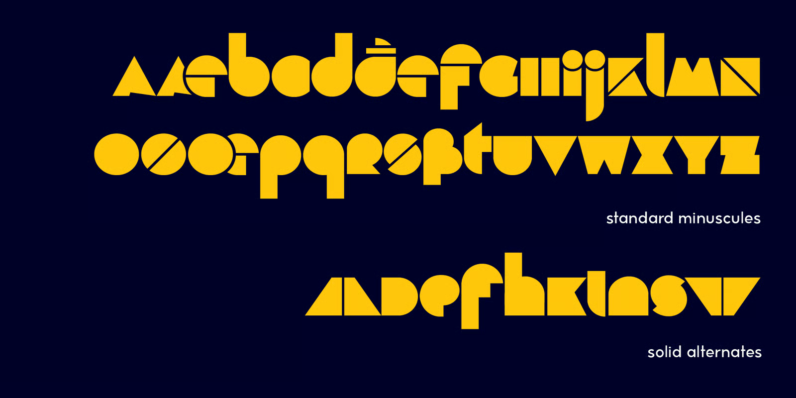
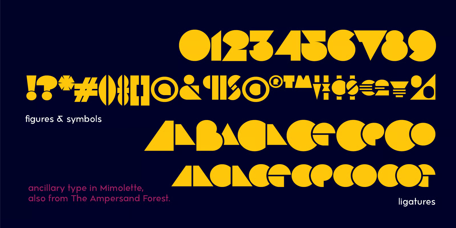
In addition to its lowercase and caps (which don't share a baseline with the lowercase, but hang below it), Another Hundred People has solid alternates (for those who don't like the divided letterforms) and overlapping ligatures!